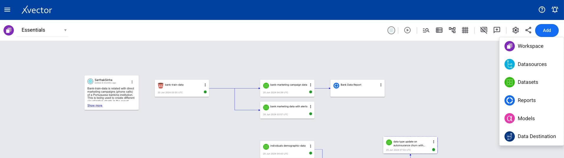
Reports
Reports transform data into stories. They offer a dynamic canvas where users can visualize and explore information, crafting interactive dashboards that bring data to life. Businesses can collaborate effectively by delving into models, slicing and dicing data, and drilling into details.
Users organize their stories in sheets. Sheets comprise various visual and interactive components. Collaboration can be extended within and beyond the organization by embedding reports in multiple applications.
Report Basics
Section titled “Report Basics”Report
Section titled “Report”Reports are used for data exploration and creating visualizations that provide insights into business goals and operations.
Sheets
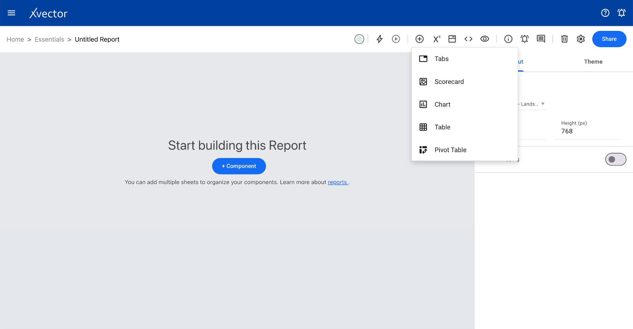
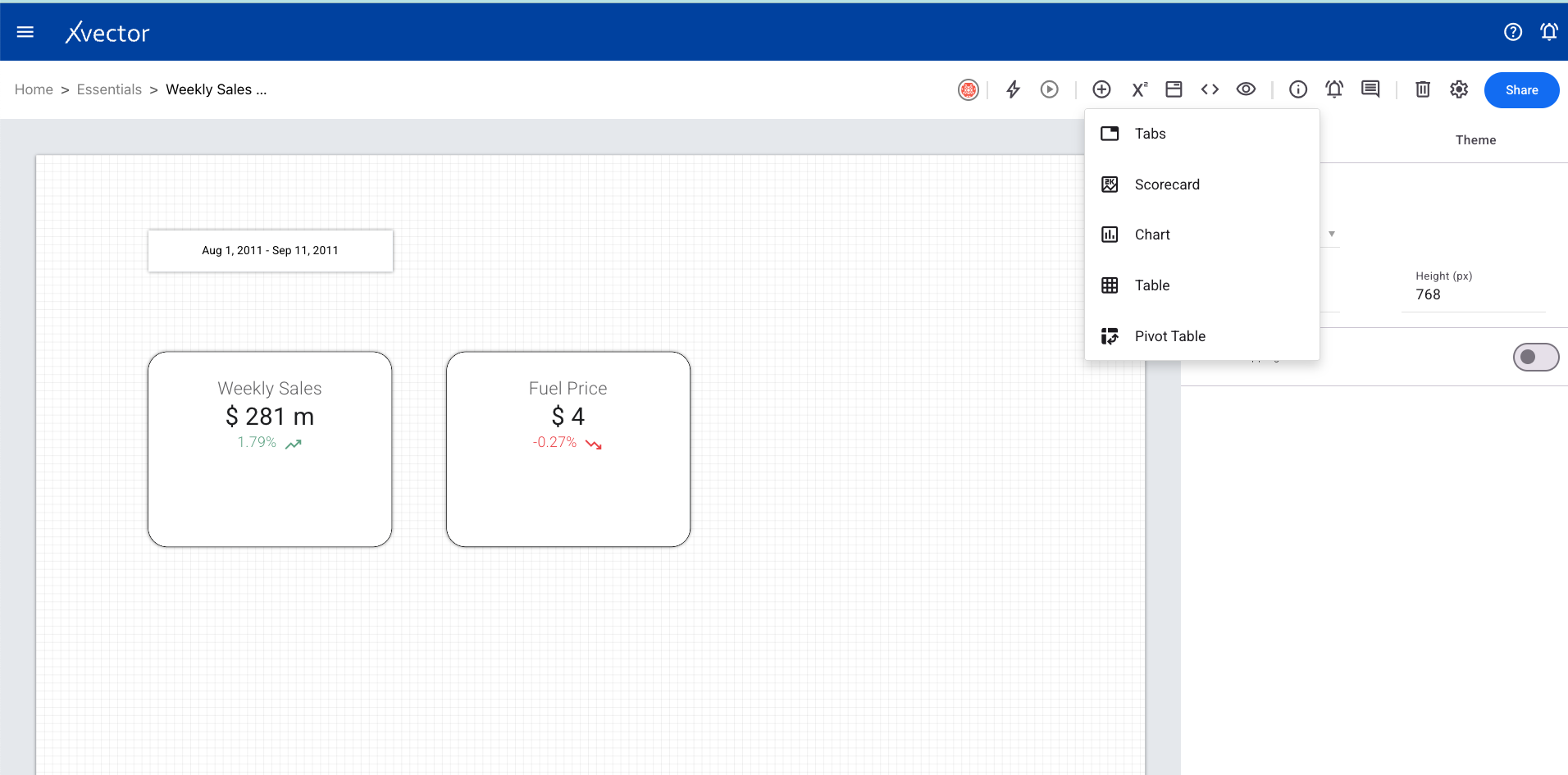
Section titled “Sheets”Users organize stories in sheets comprising visual and interactive components. Multiple sheets can be created in a report, each containing components like line charts, pie charts, and data filters. Sheets can be renamed and rearranged.
Report Drivers
Section titled “Report Drivers”Drivers are needed to view and interact with live data on report components. All reports use a default driver unless configured to use a dedicated one.
Layout
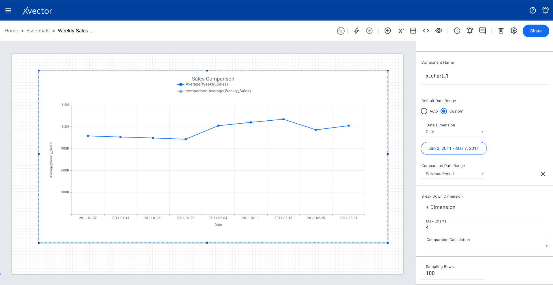
Section titled “Layout”Layout allows users to choose canvas sizes from available options or create custom ones (width and height). It also provides a snapping option for arranging components.
Themes make it easy to set several settings for the report. Choose from a list of themes or customize them.
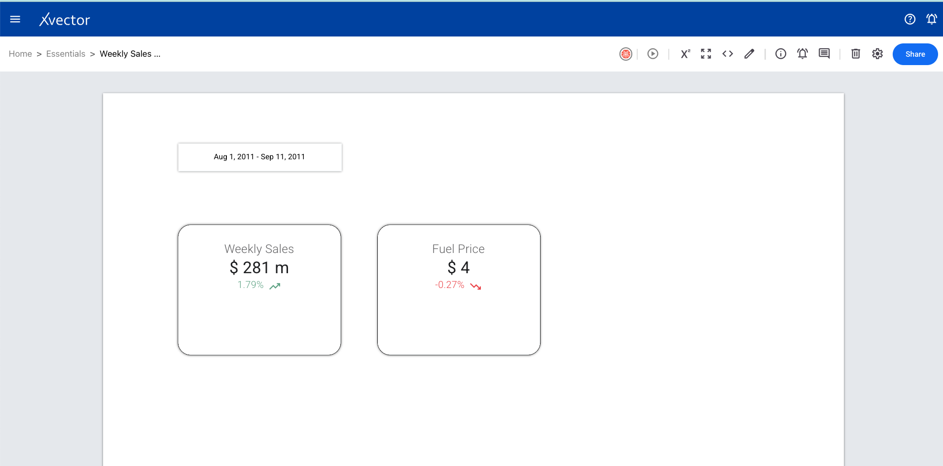
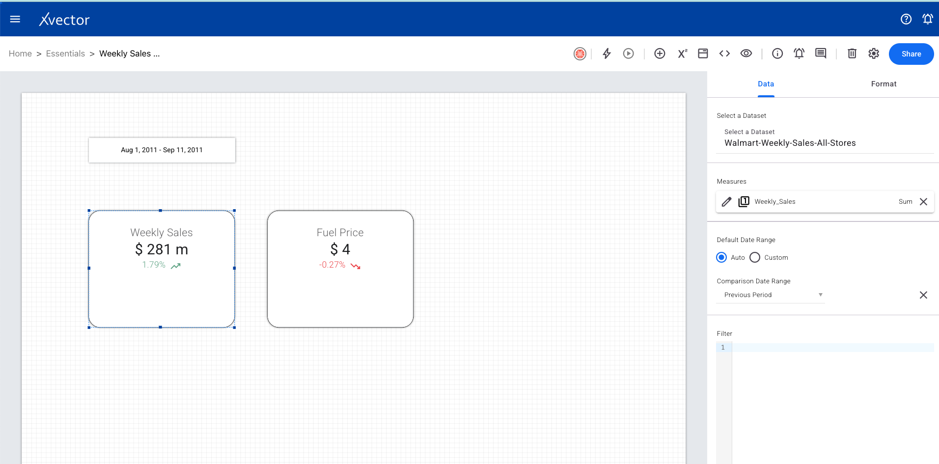
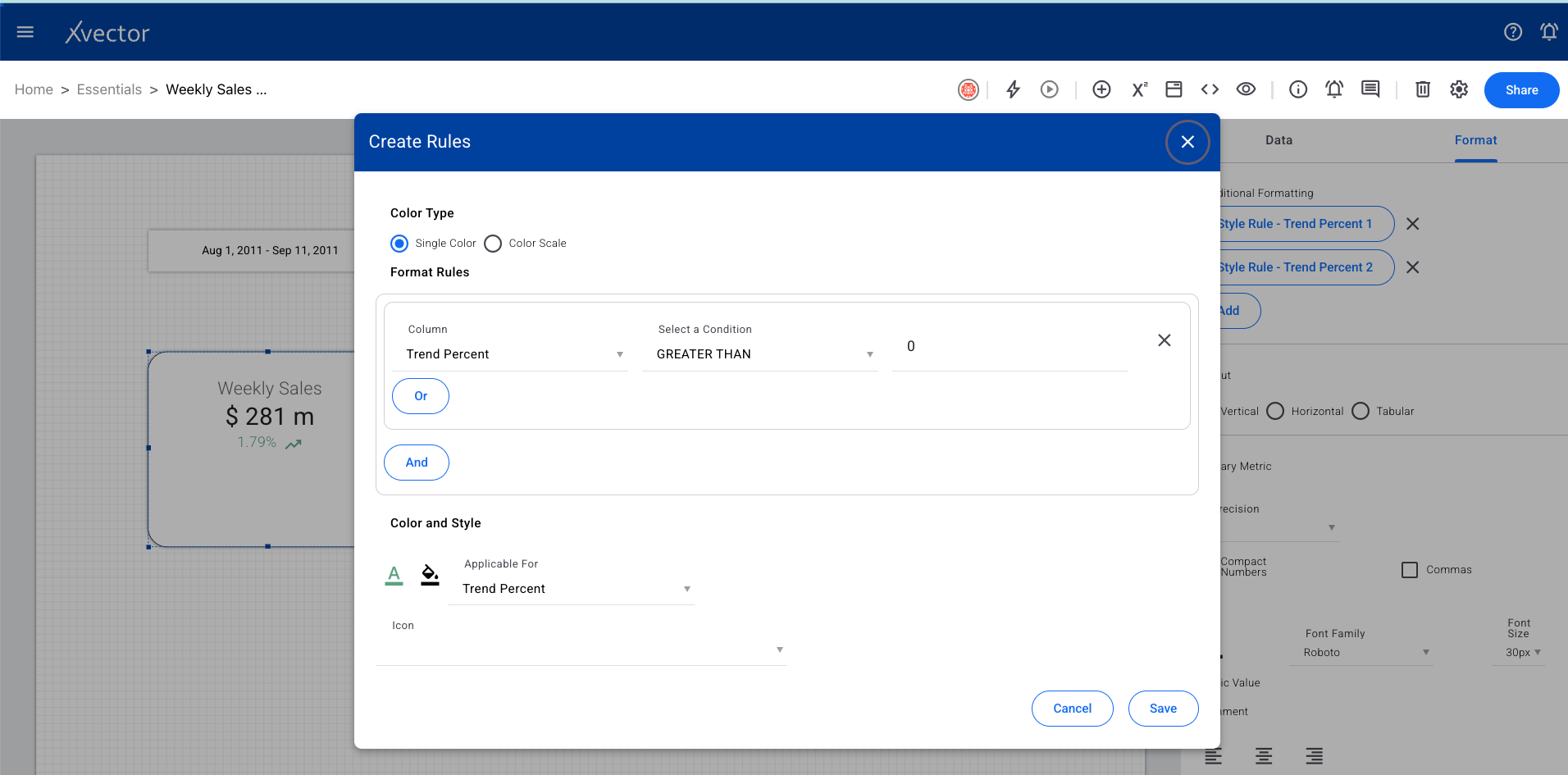
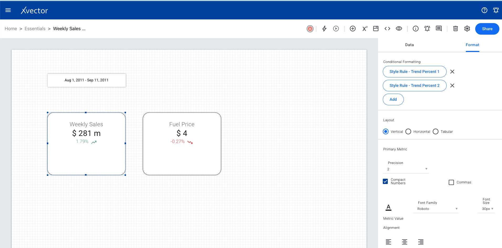
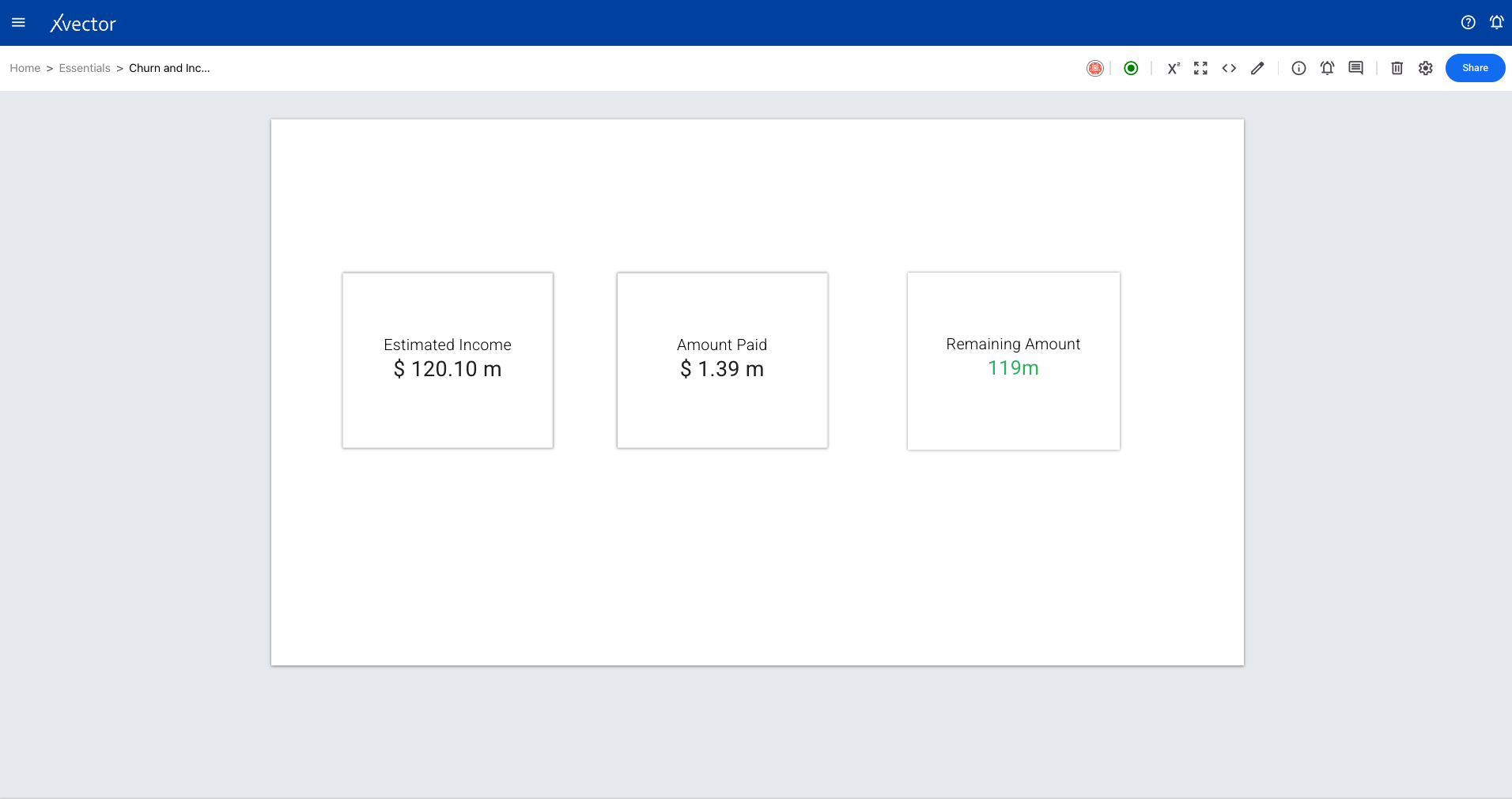
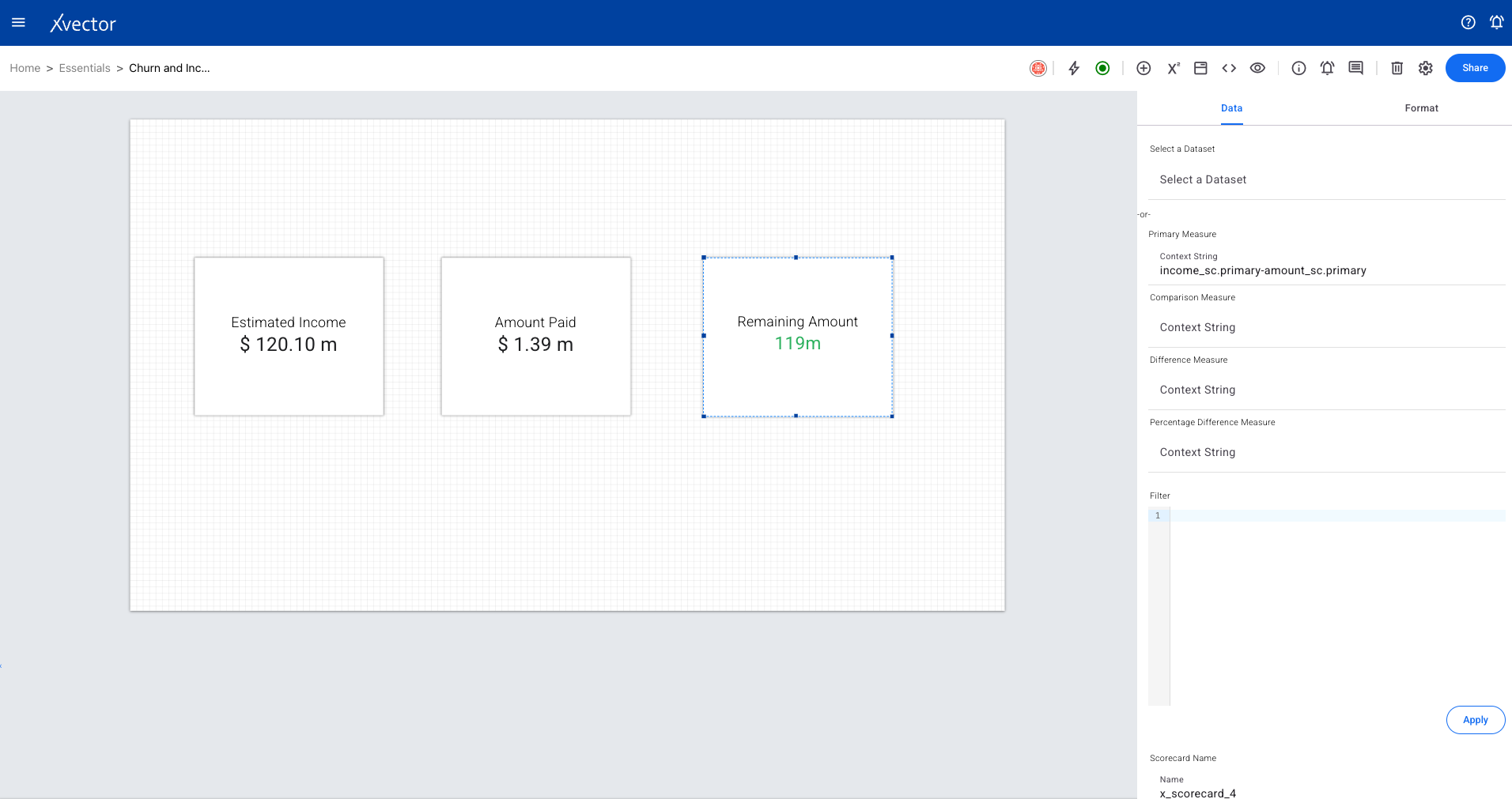
Scorecard
Section titled “Scorecard”A scorecard is a visual summary of key performance indicators (KPIs) that helps stakeholders quickly assess performance against goals.
Primary Metrics — The most important metrics that directly measure success or failure (e.g., Total Revenue, Conversion Rate, Production Efficiency).
Secondary Metrics — Supporting indicators that provide context for primary metrics (e.g., Average Deal Size, Click-Through Rate, Employee Productivity).
Steps to create a scorecard:
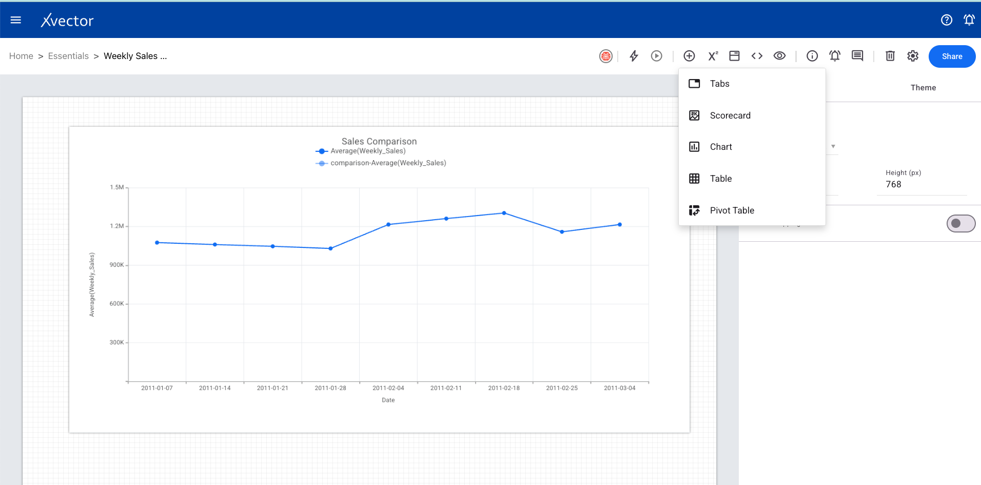
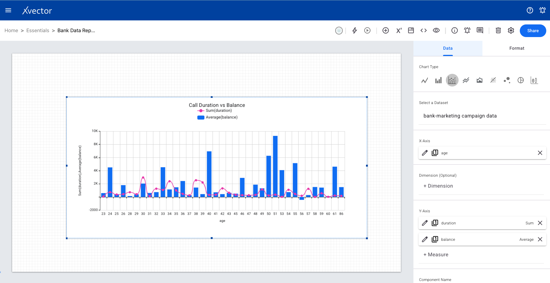
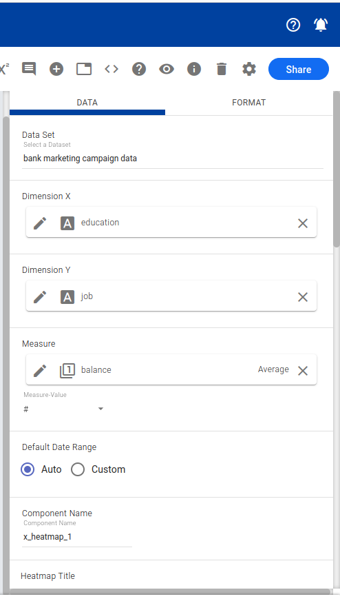
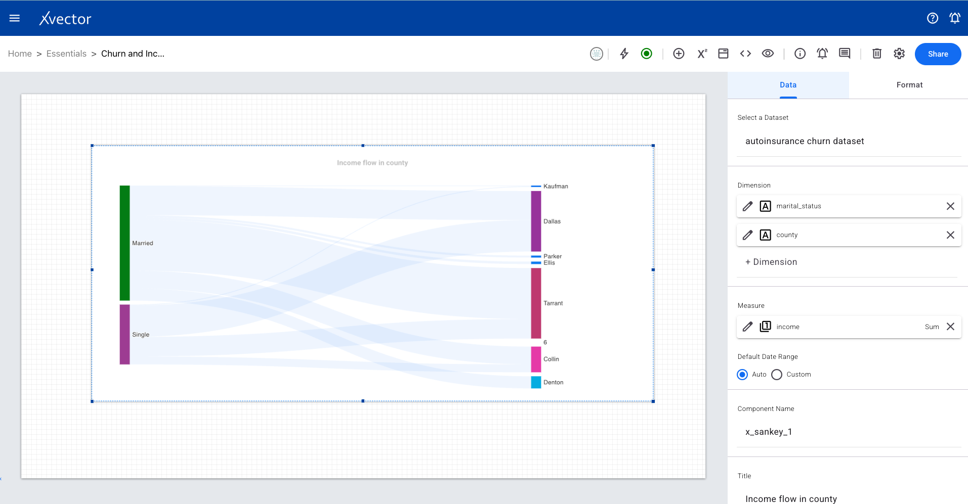
- Click on Add Component (+) and choose Scorecard
- Use the Data tab: select a dataset, select measure (numerical column with aggregate function), set default and comparison date ranges, provide a name
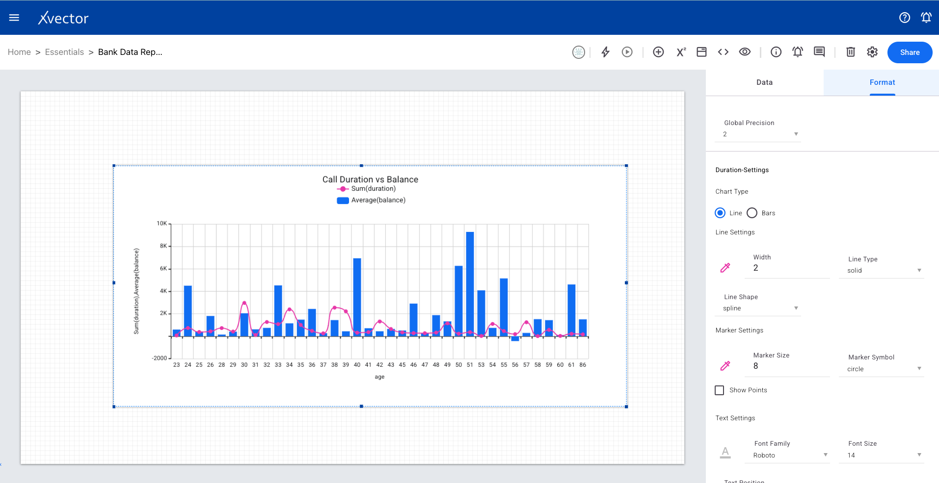
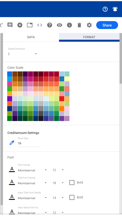
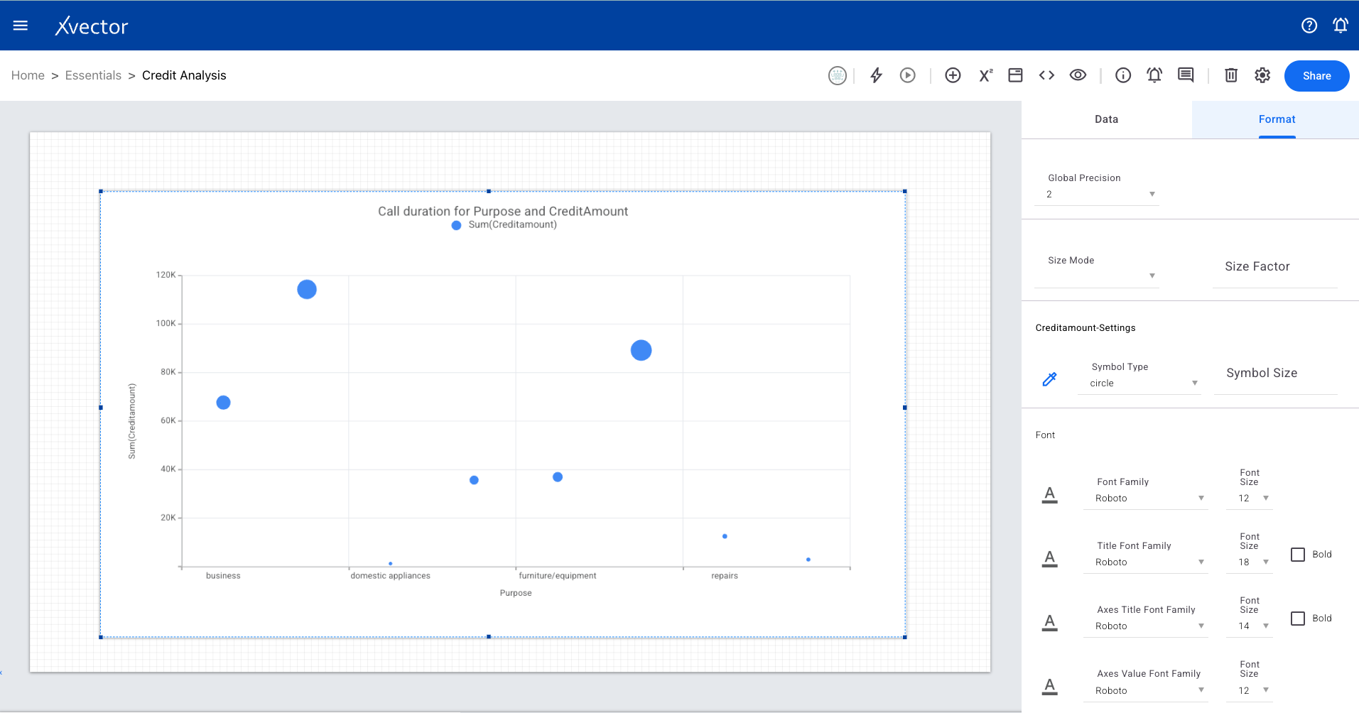
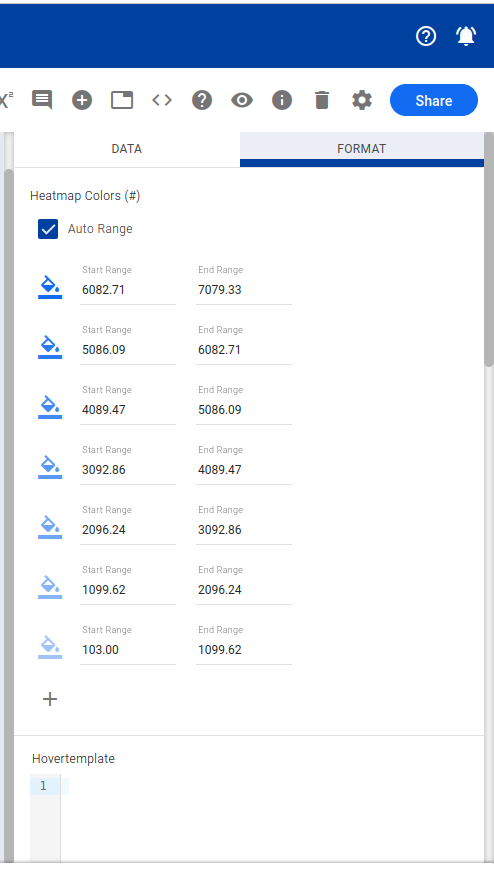
- Use the Format tab for conditional formatting rules


Charts
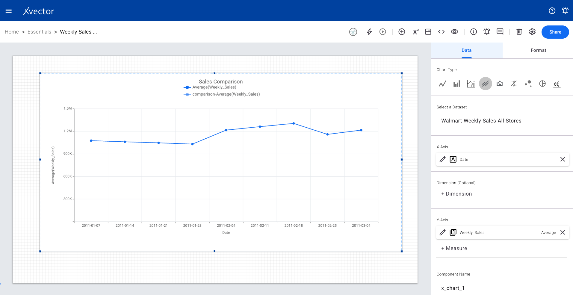
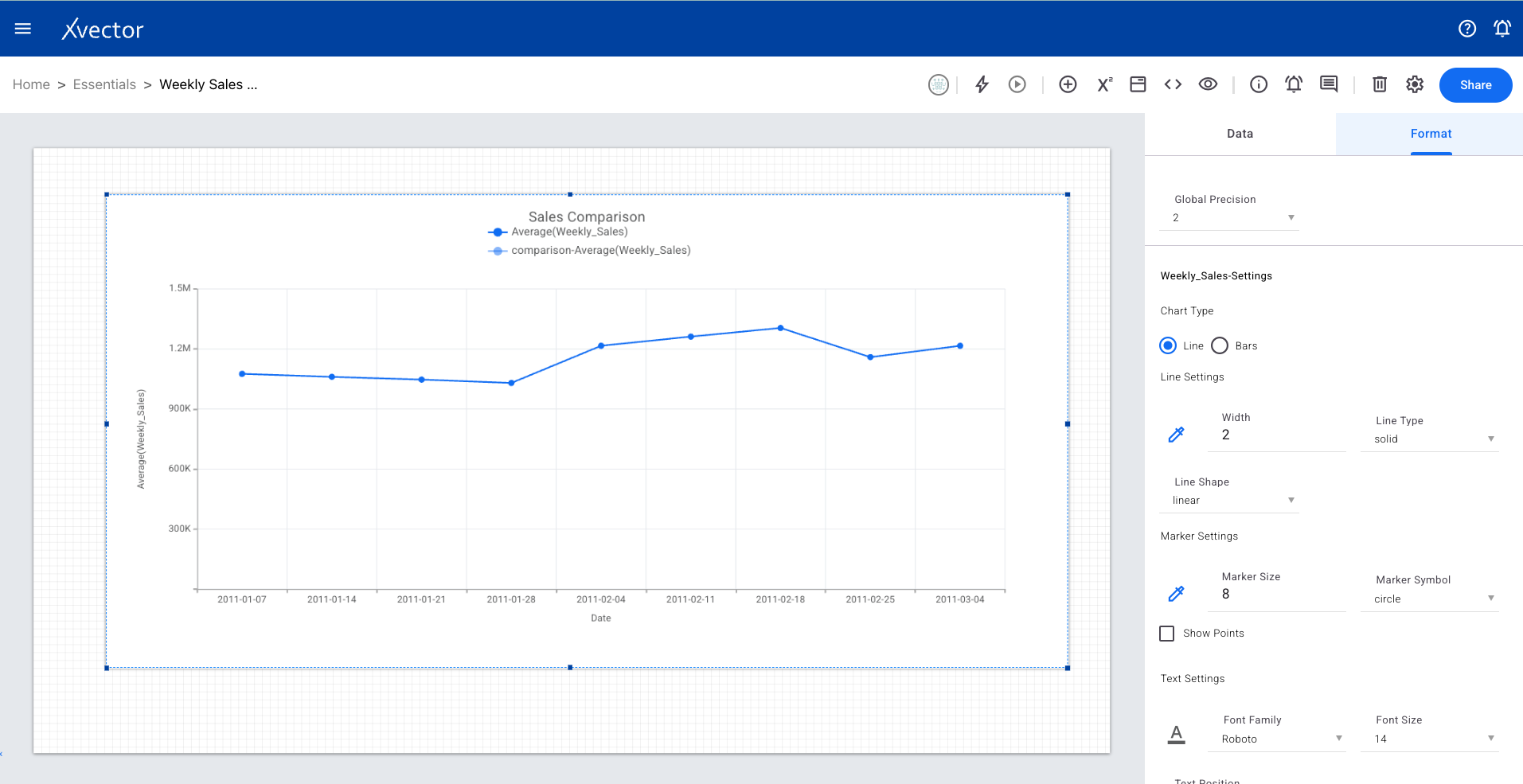
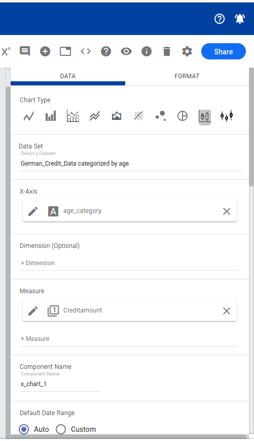
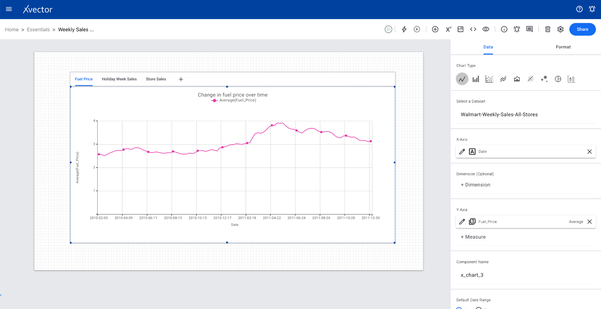
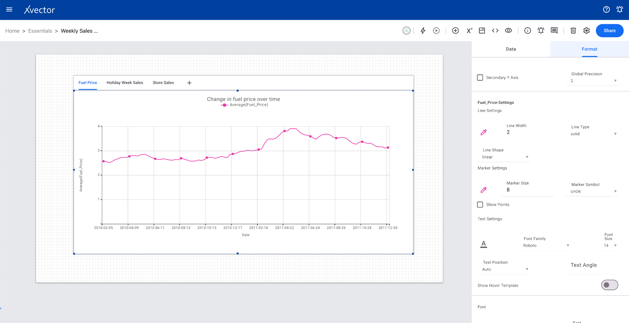
Section titled “Charts”Line Chart
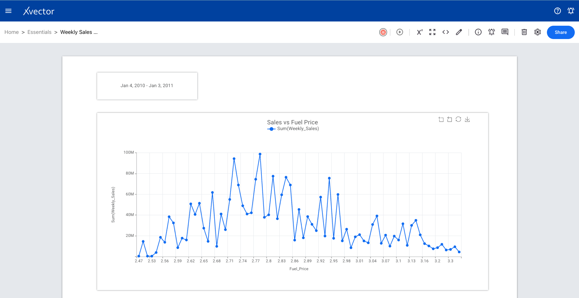
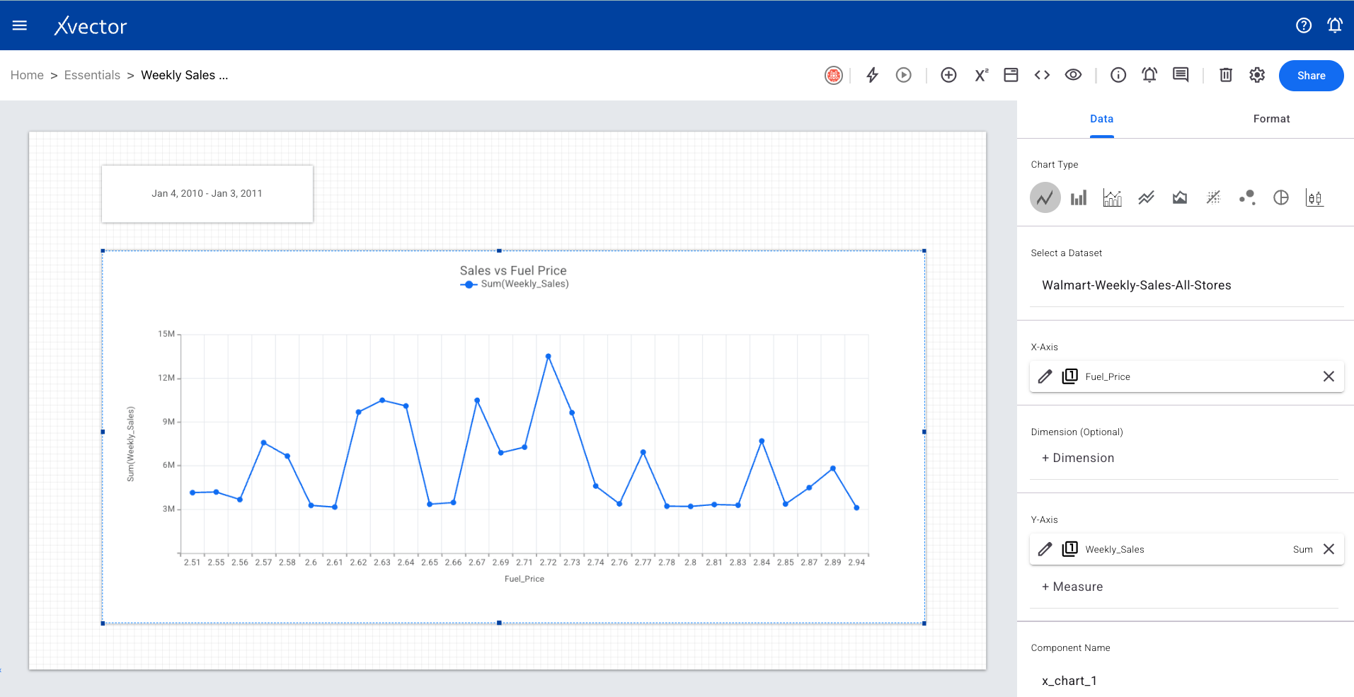
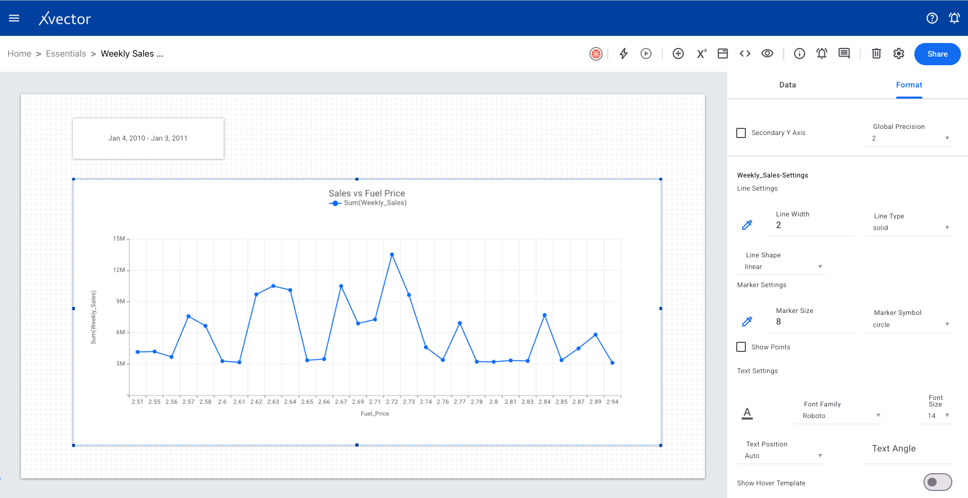
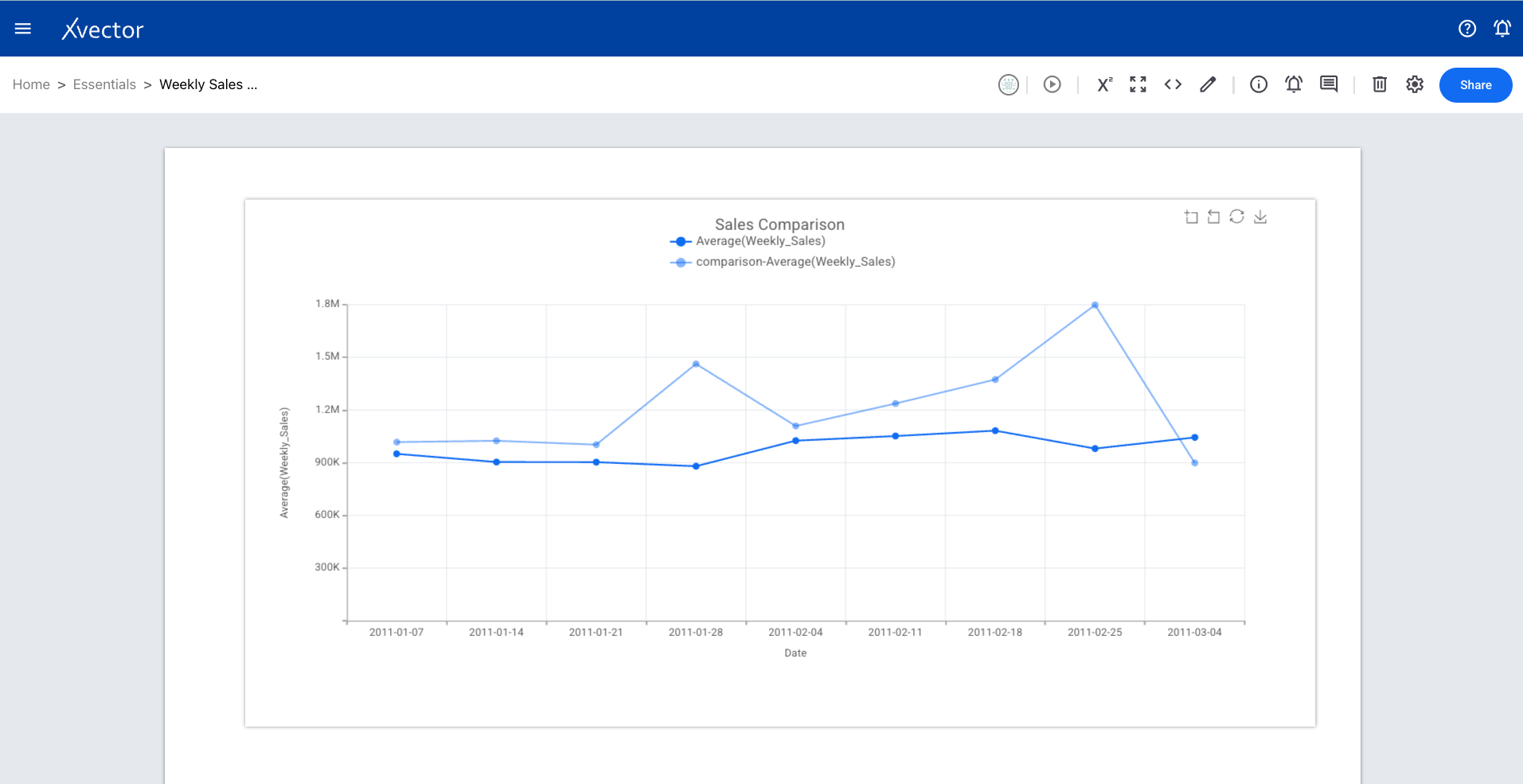
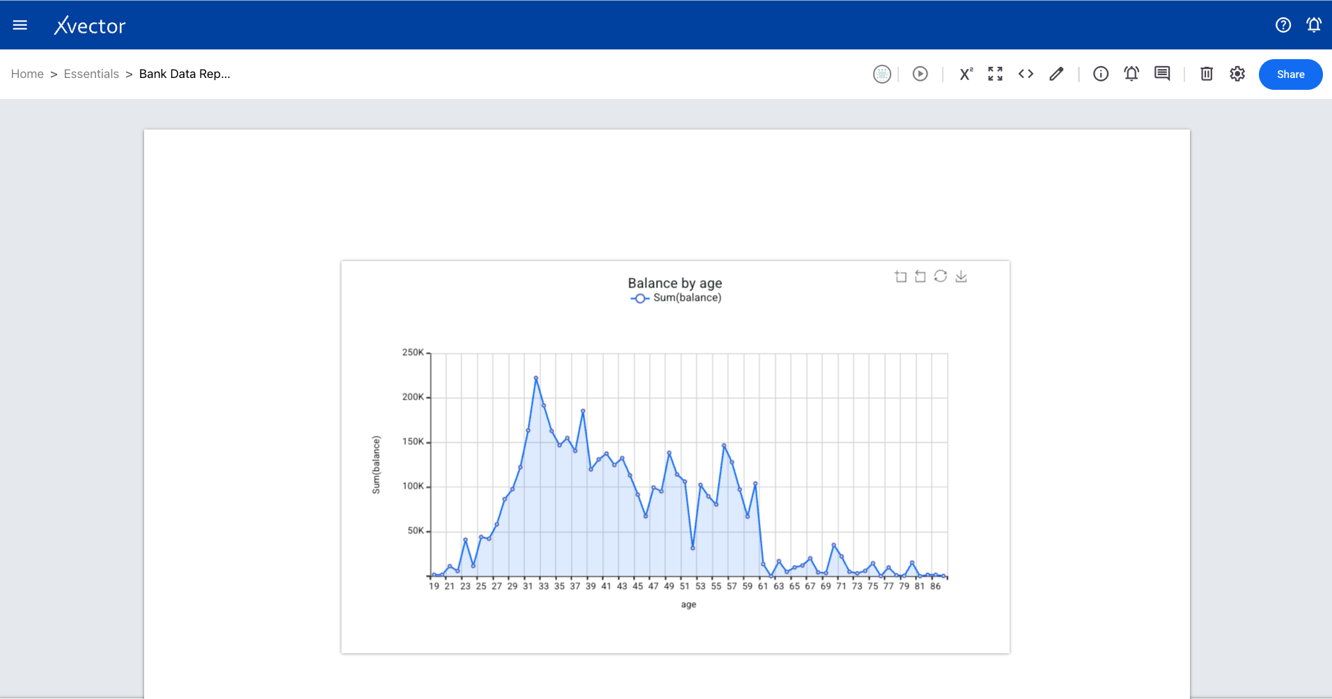
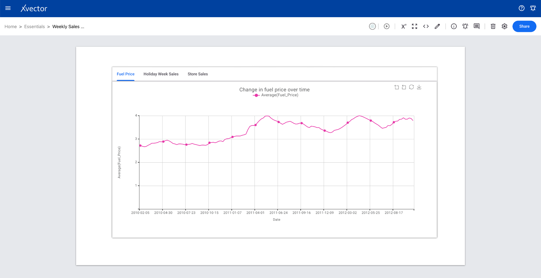
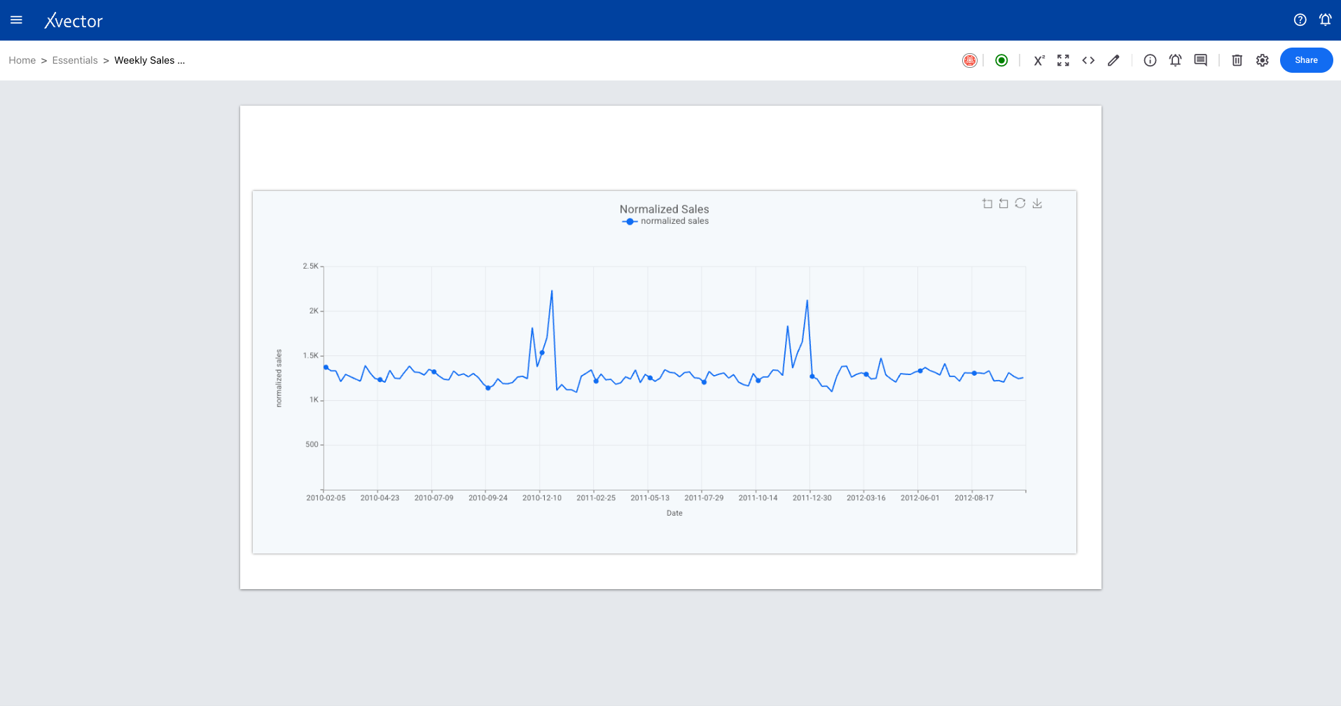
Section titled “Line Chart”A line chart displays trends between continuous numeric values. It connects data points with a line, making it ideal for showing changes over time.
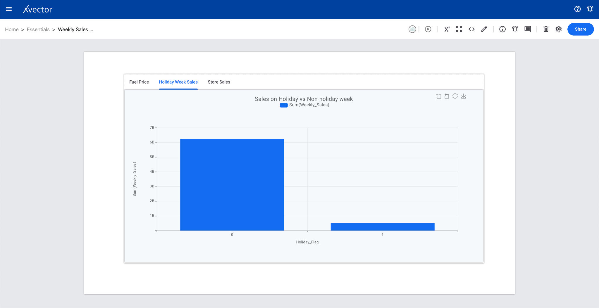
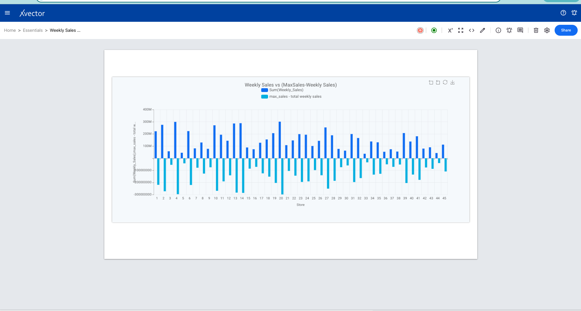
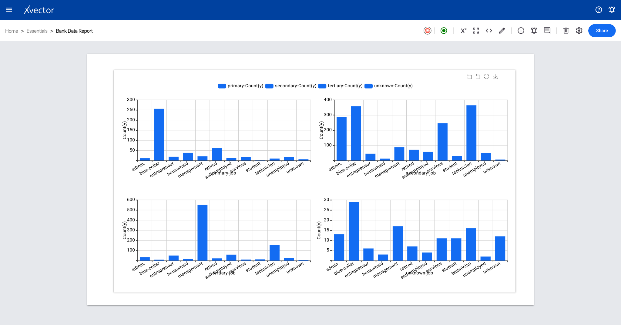
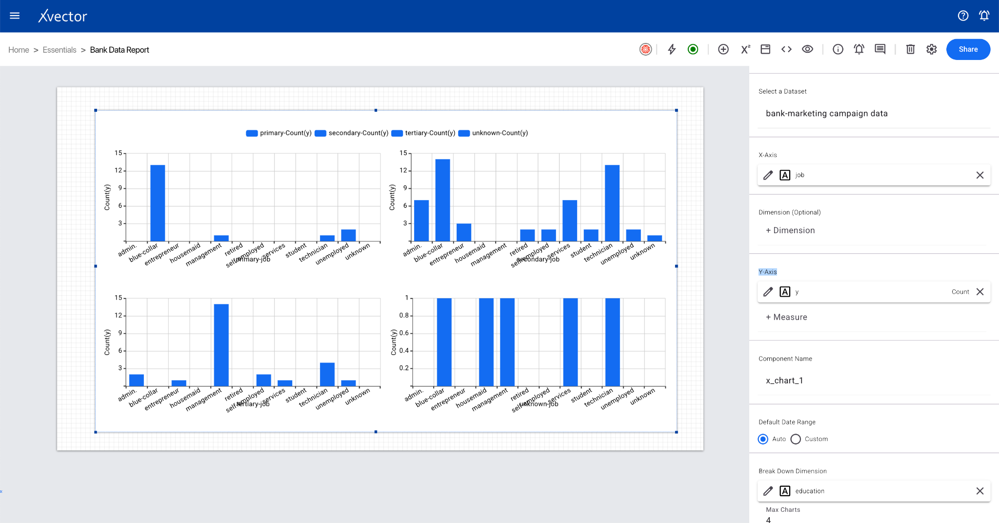
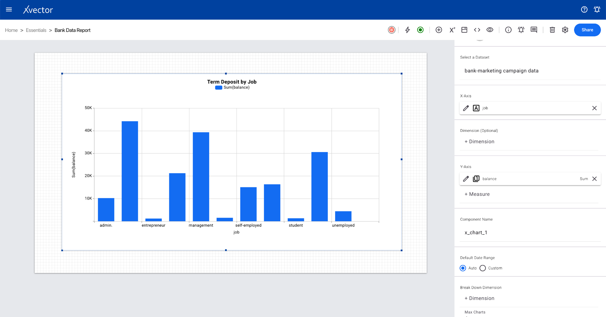
Bar Chart
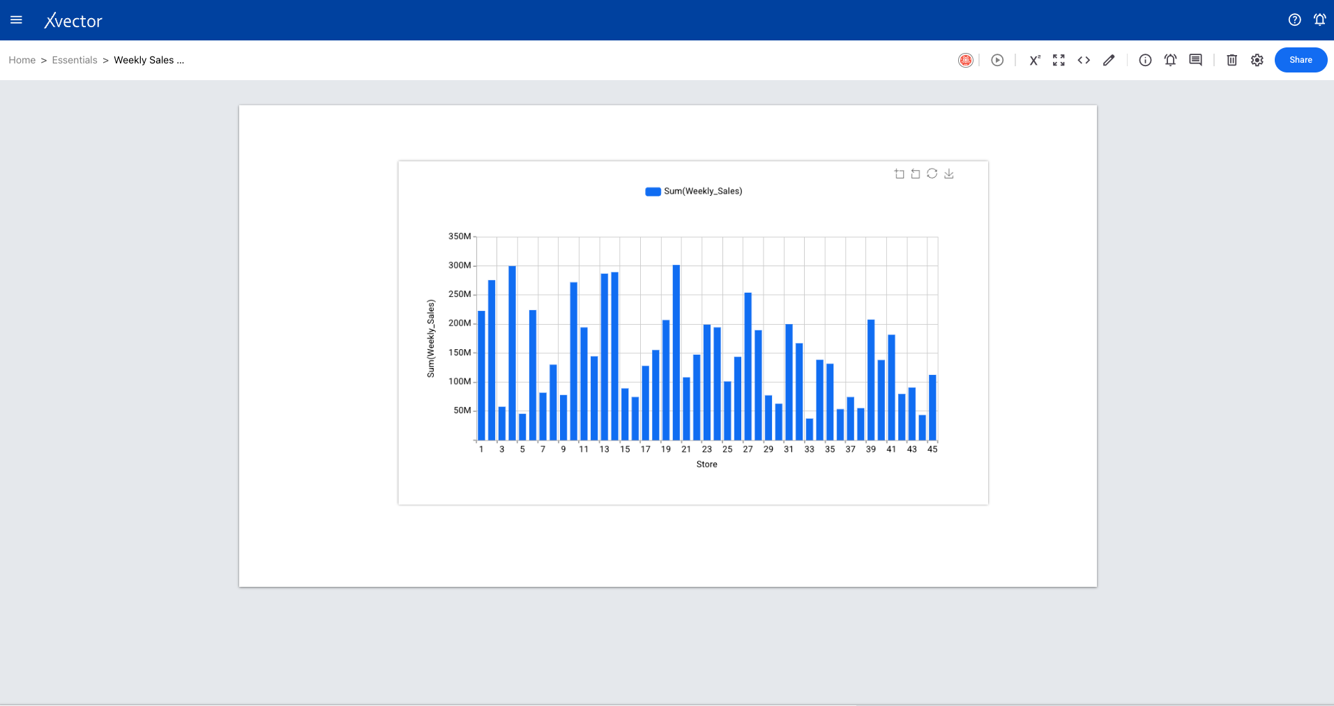
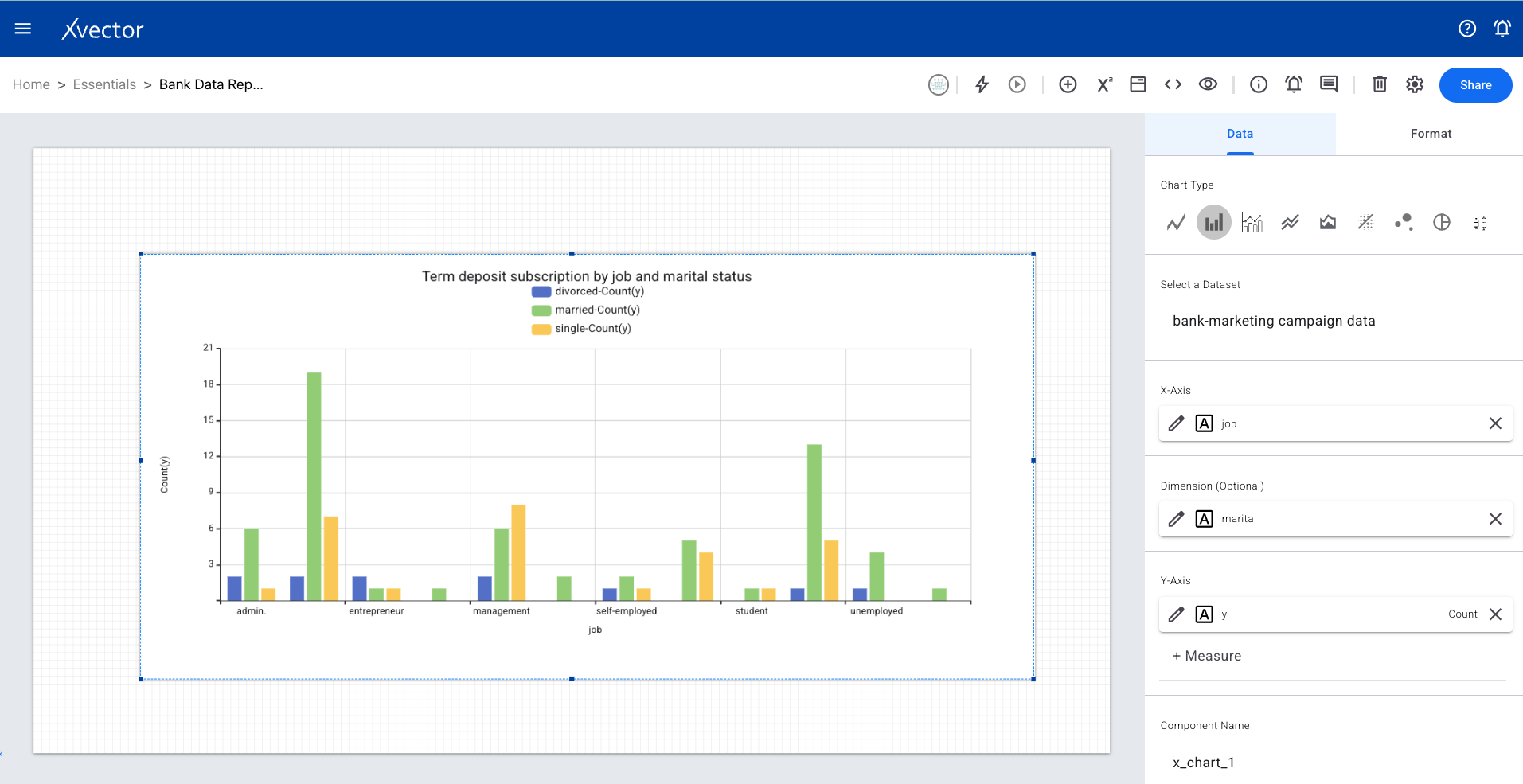
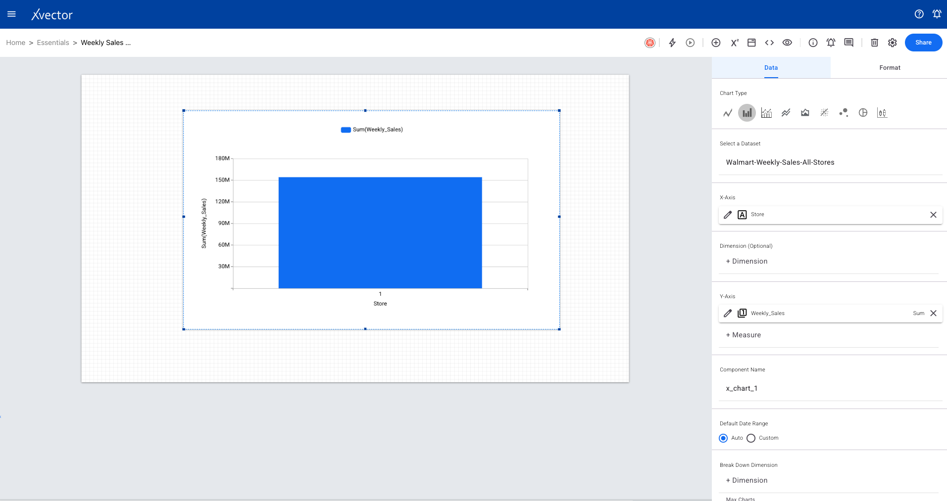
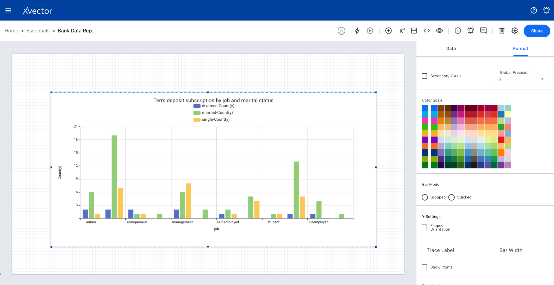
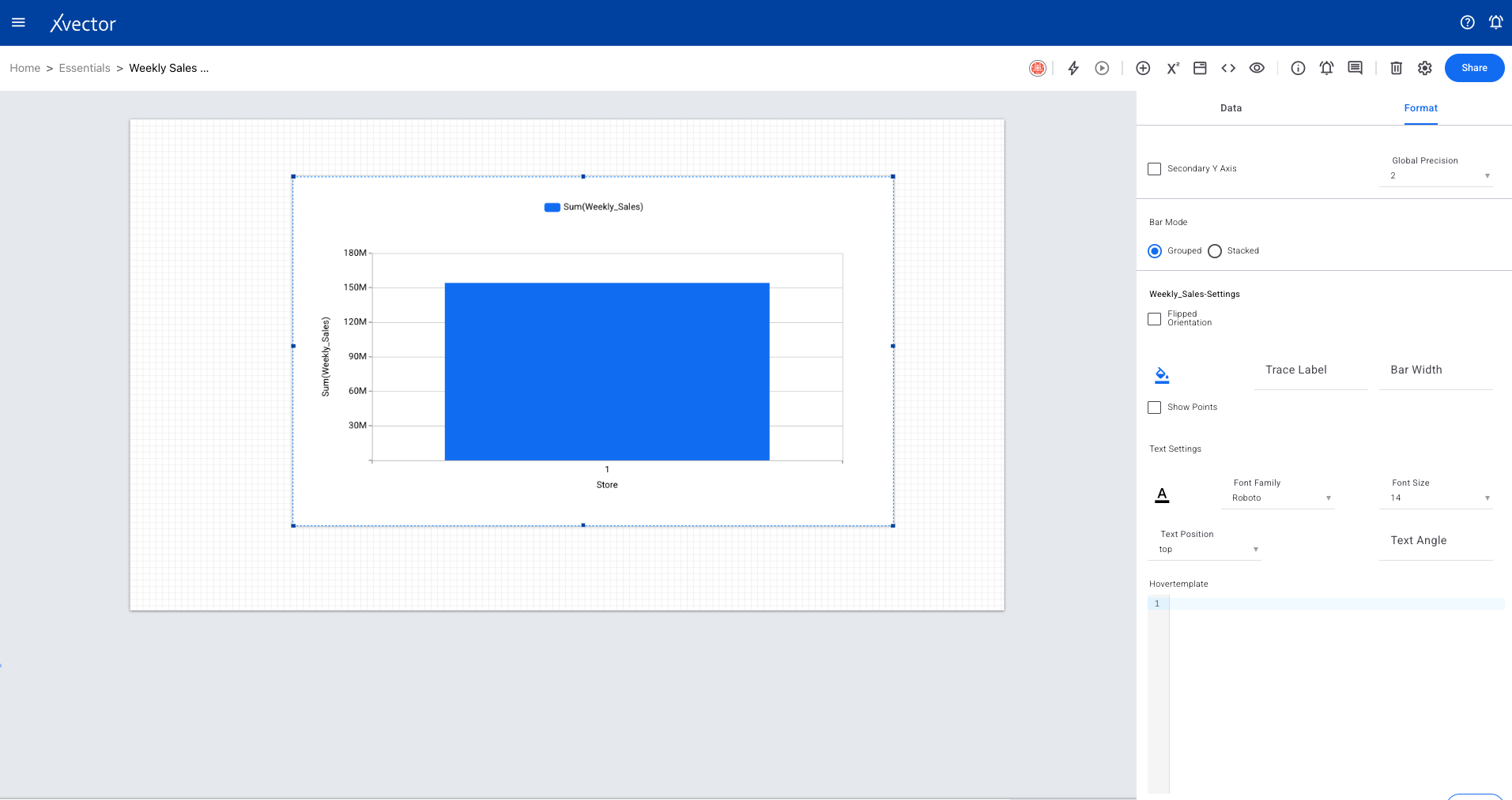
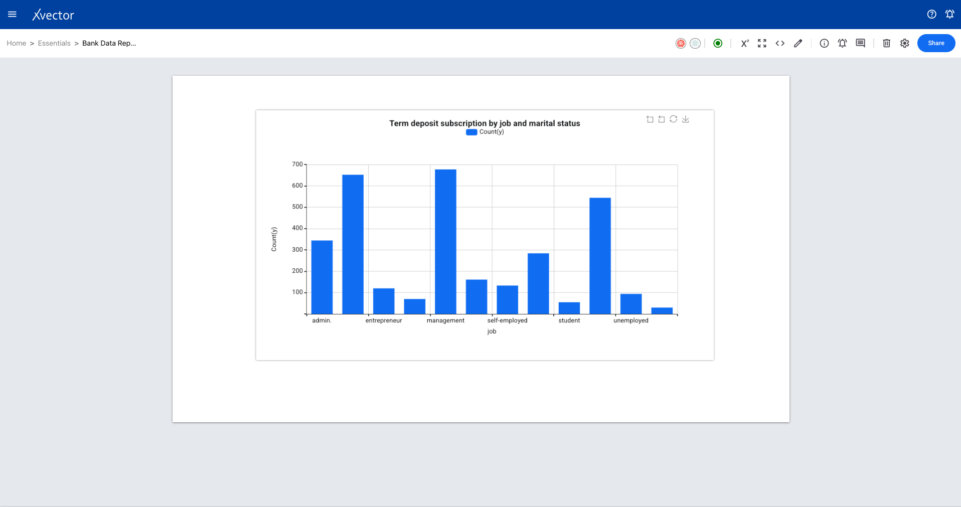
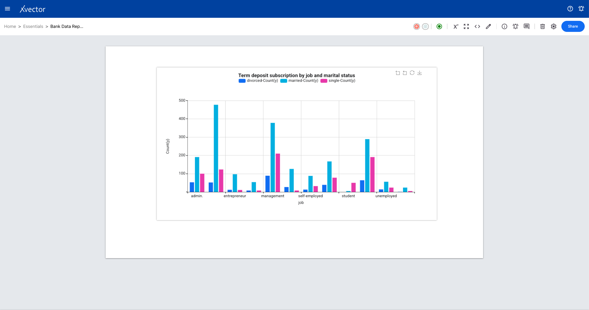
Section titled “Bar Chart”Represents data by rectangular bars where bar length/height is proportional to the value associated with each category.
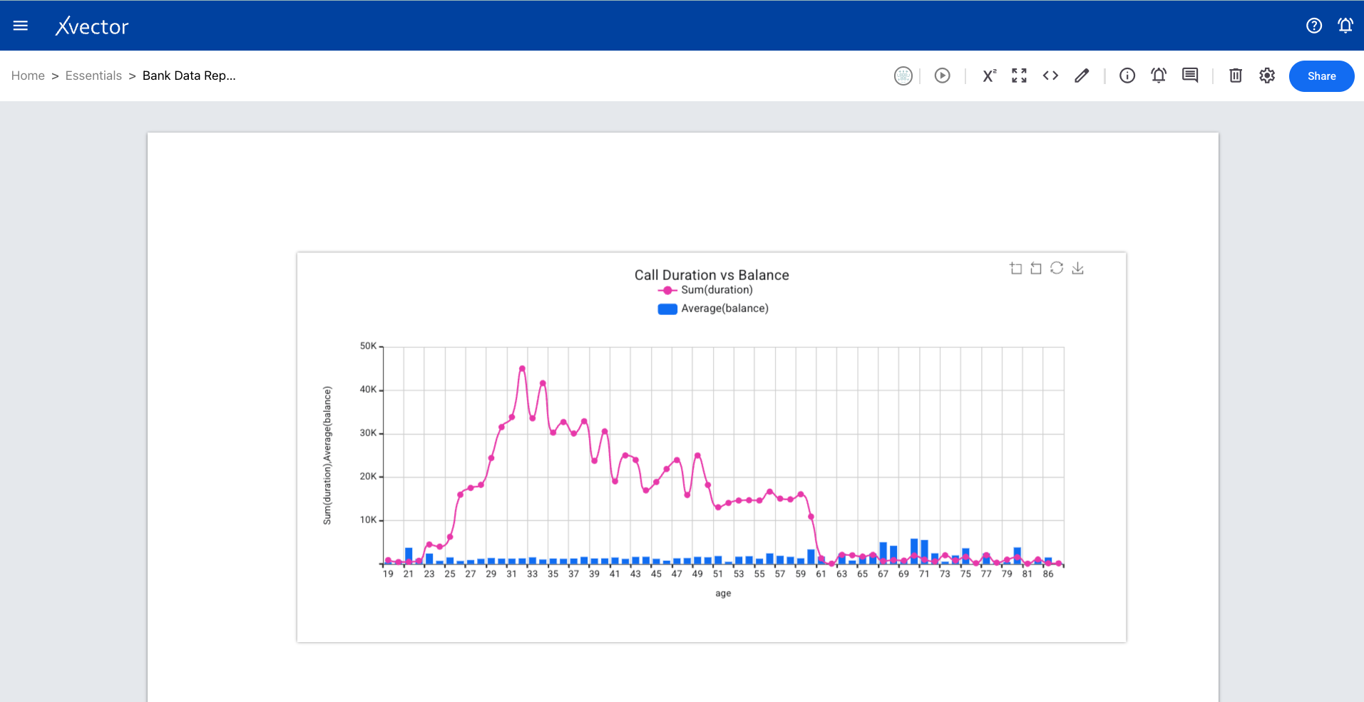
Combo Chart
Section titled “Combo Chart”Combines line and bar chart types into a single view, allowing display of different aspects of data simultaneously for easier comparison and analysis.
Timeseries Chart
Section titled “Timeseries Chart”A type of line chart designed to visualize trends and patterns over time. Optimized for date-based x-axis data.
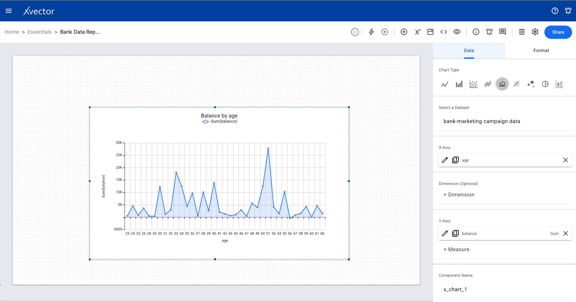
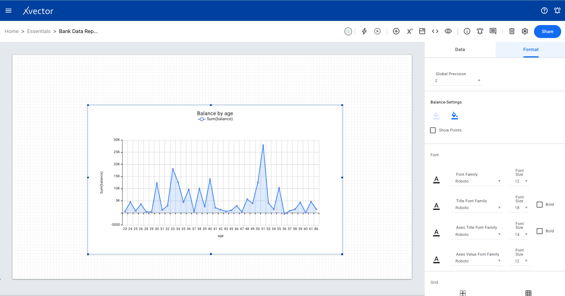
Area Chart
Section titled “Area Chart”Uses both lines and shaded areas to depict how data points change over time or another numeric variable. Effective for showing volume and magnitude.
Scatter Plot
Section titled “Scatter Plot”Visually explores relationships between two numeric columns using a Cartesian coordinate system to map data points on horizontal and vertical axes.
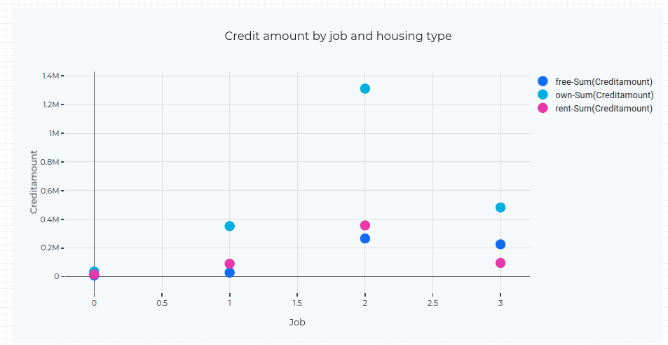
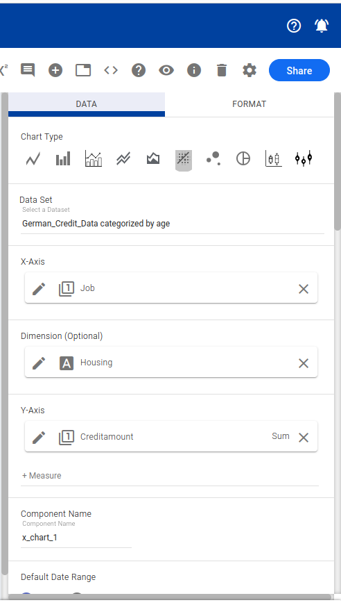
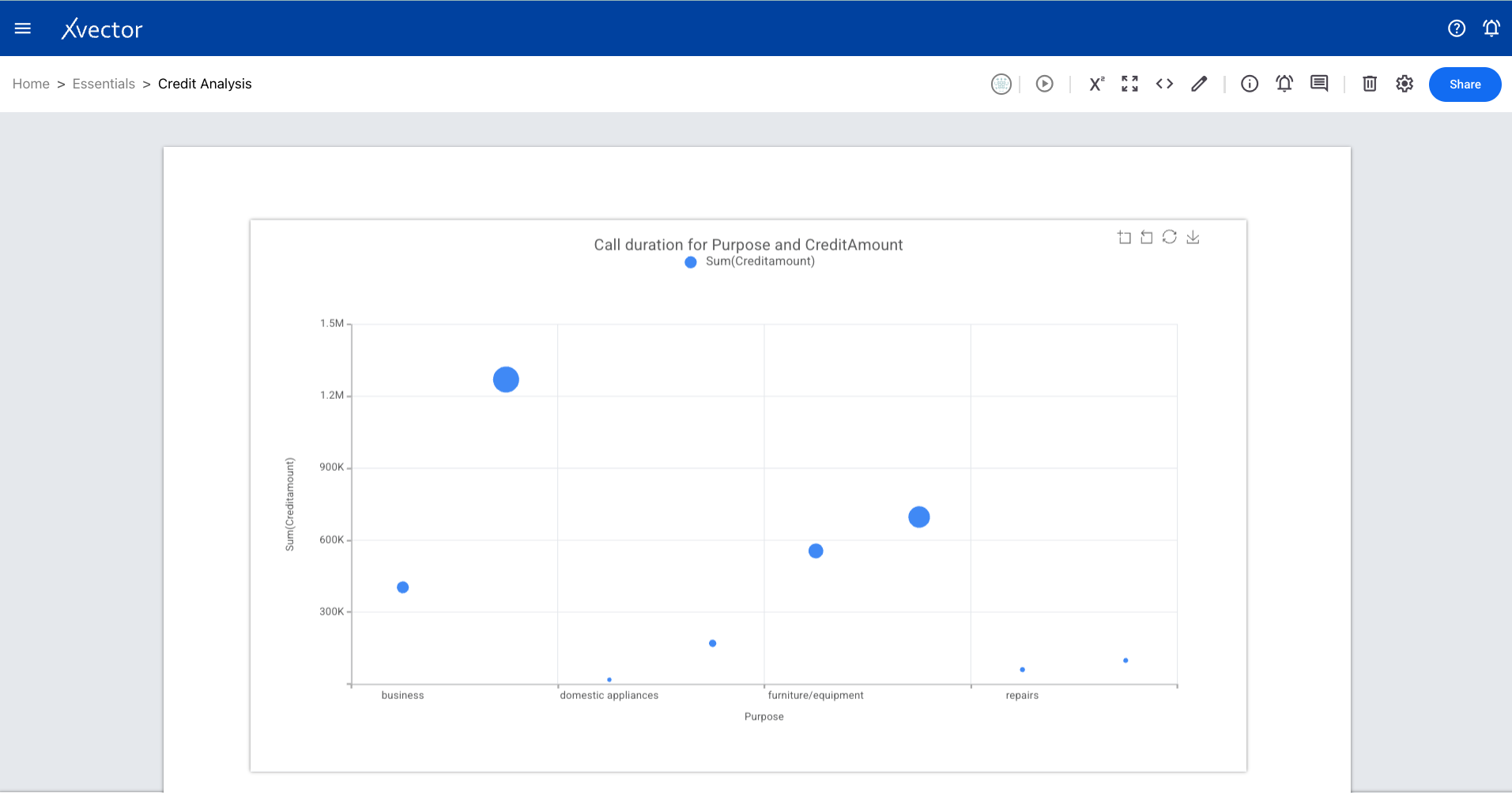
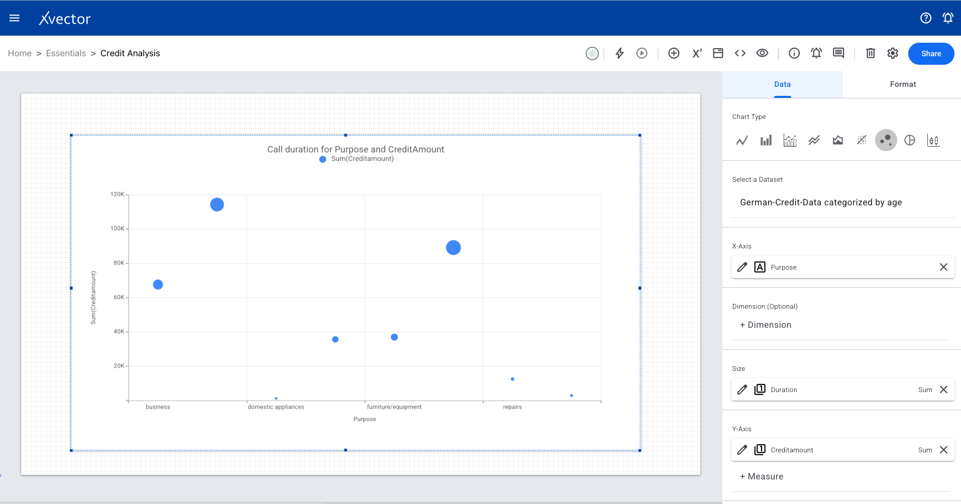
Bubble Chart
Section titled “Bubble Chart”Represents three dimensions of data using circles (bubbles). Two variables determine position on the axes, and a third determines bubble size.
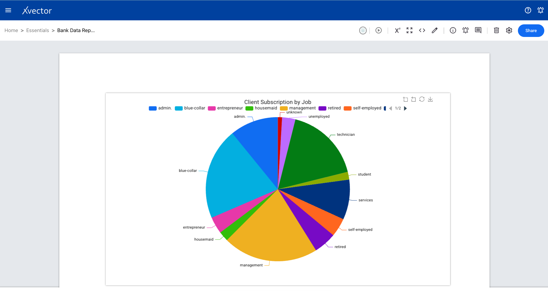
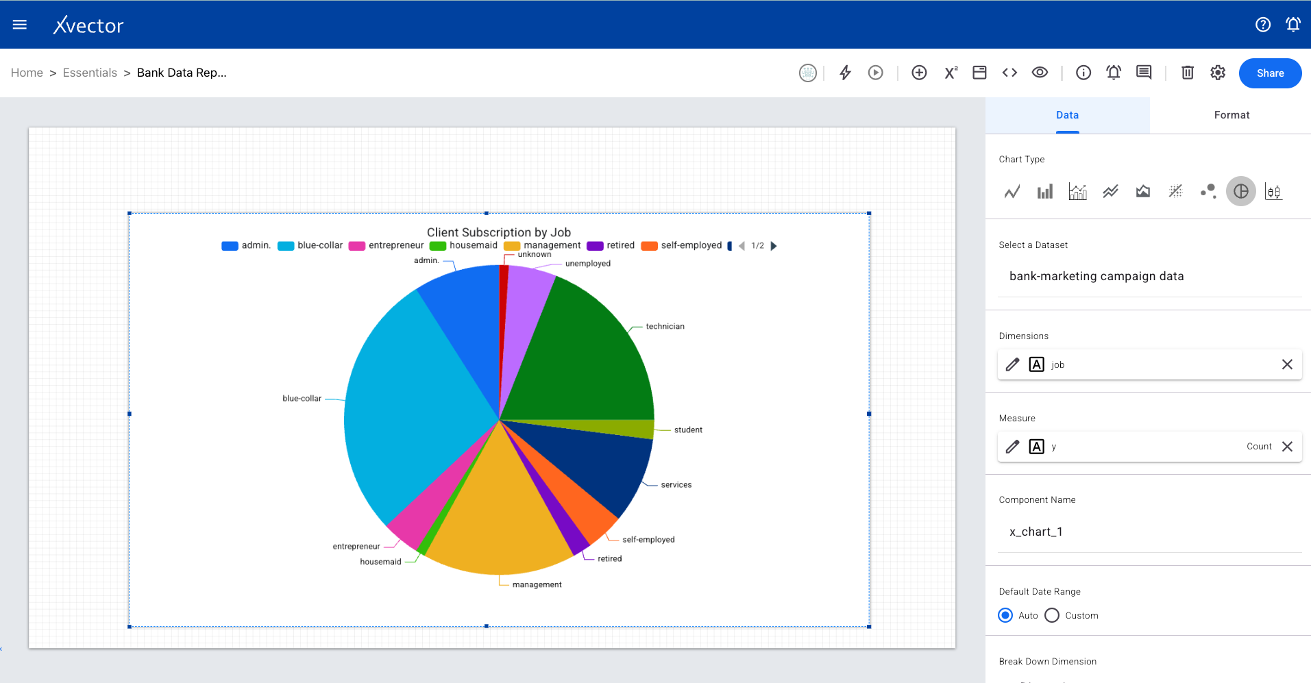
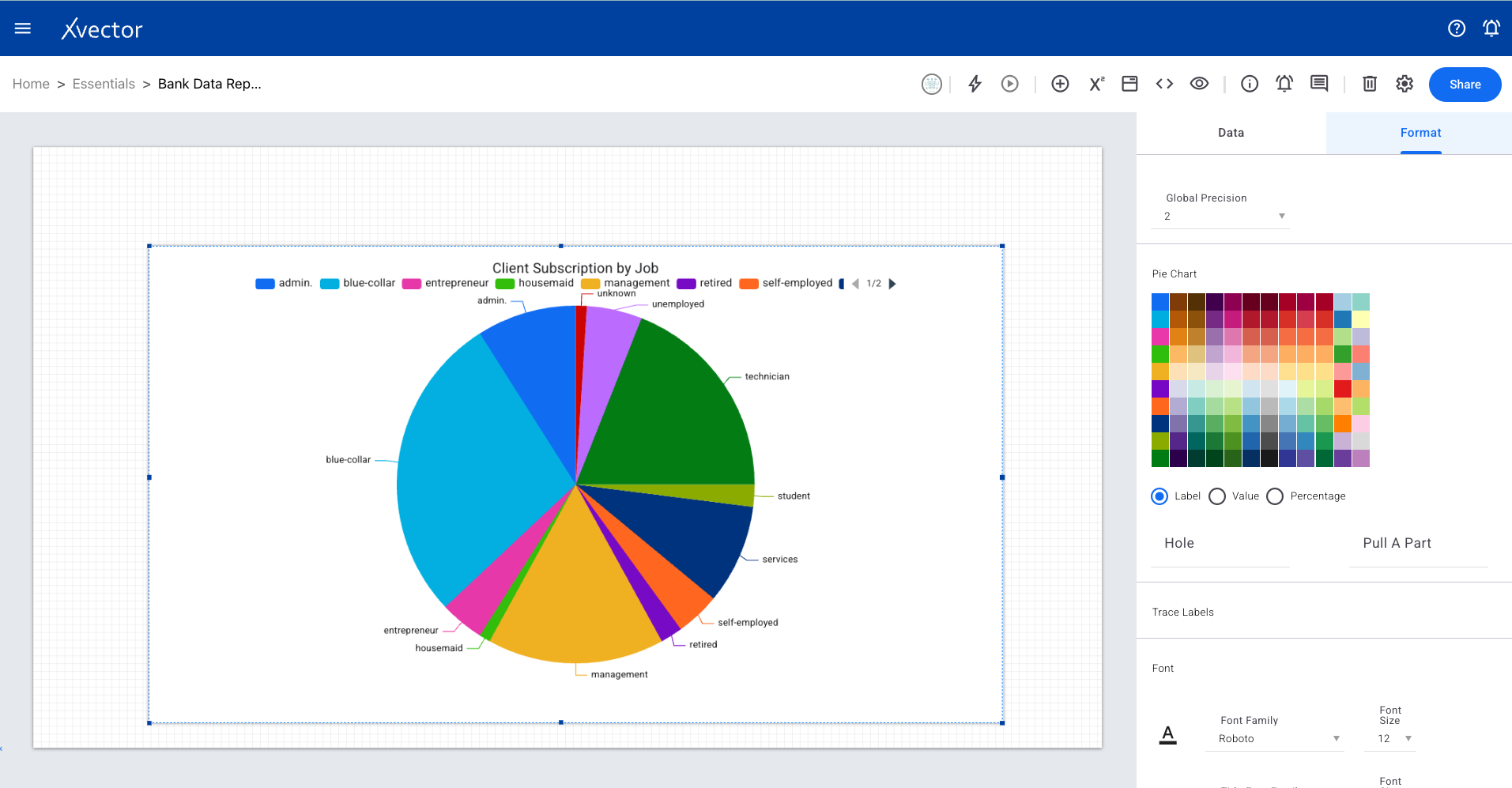
Pie Chart
Section titled “Pie Chart”A circular chart representing portions of a whole. Works best for categorical data where data points fall into distinct, non-overlapping categories.
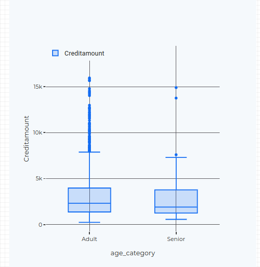
Box Chart
Section titled “Box Chart”A statistical graph that visually summarizes a dataset using its five-number summary (minimum, Q1, median, Q3, maximum). Great for seeing the spread of data and identifying outliers.
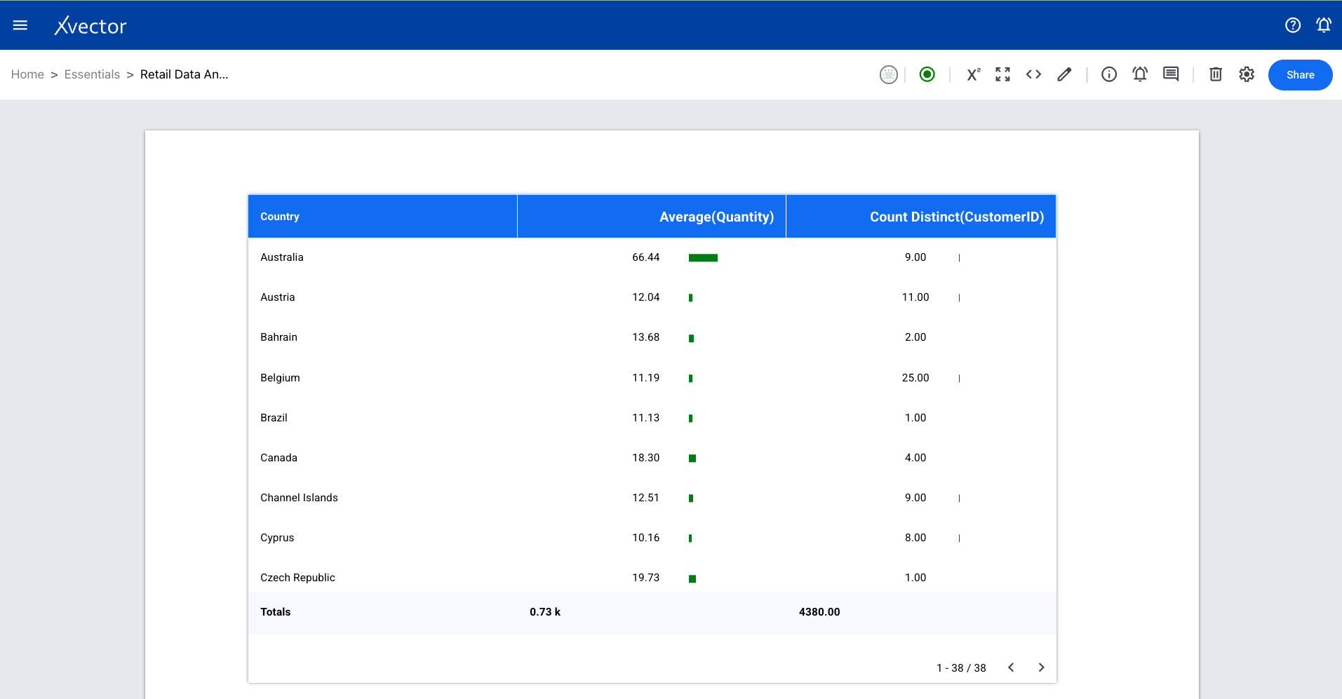
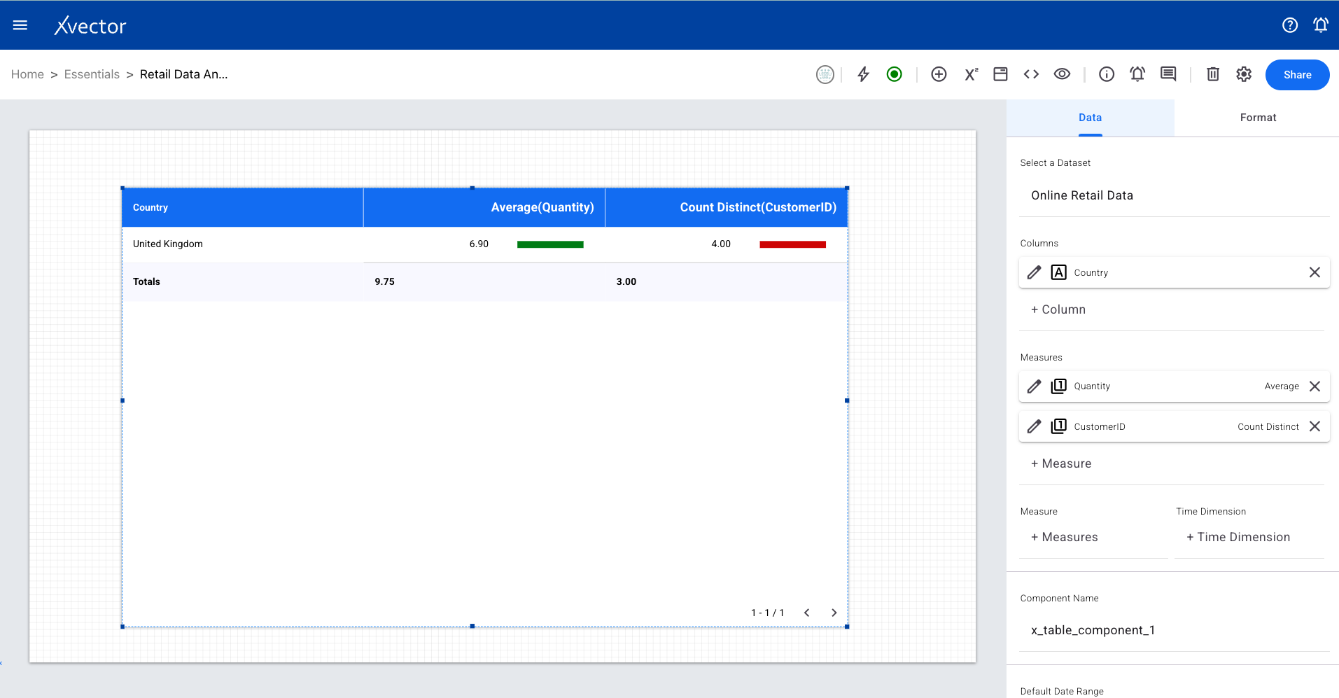
Presents information in a grid format with rows and columns, making it easy to analyze multiple data points across categories.
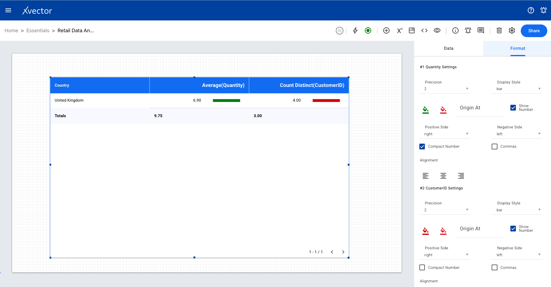
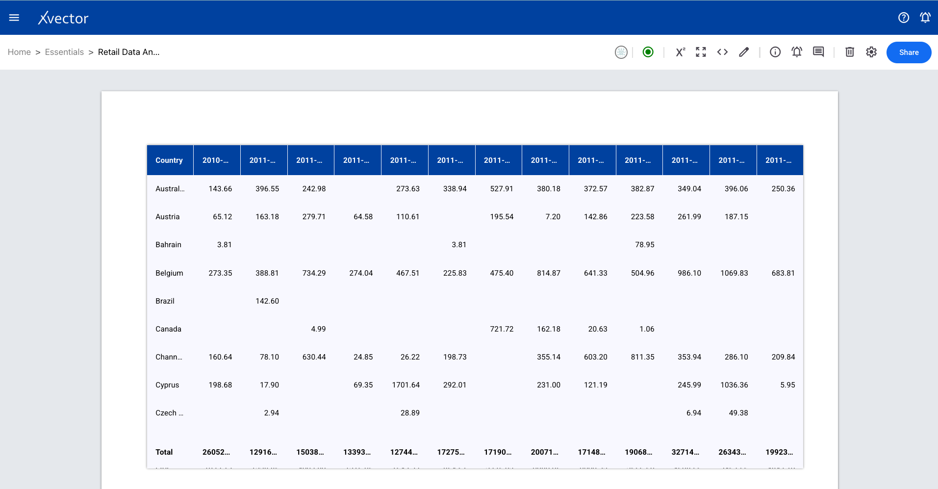
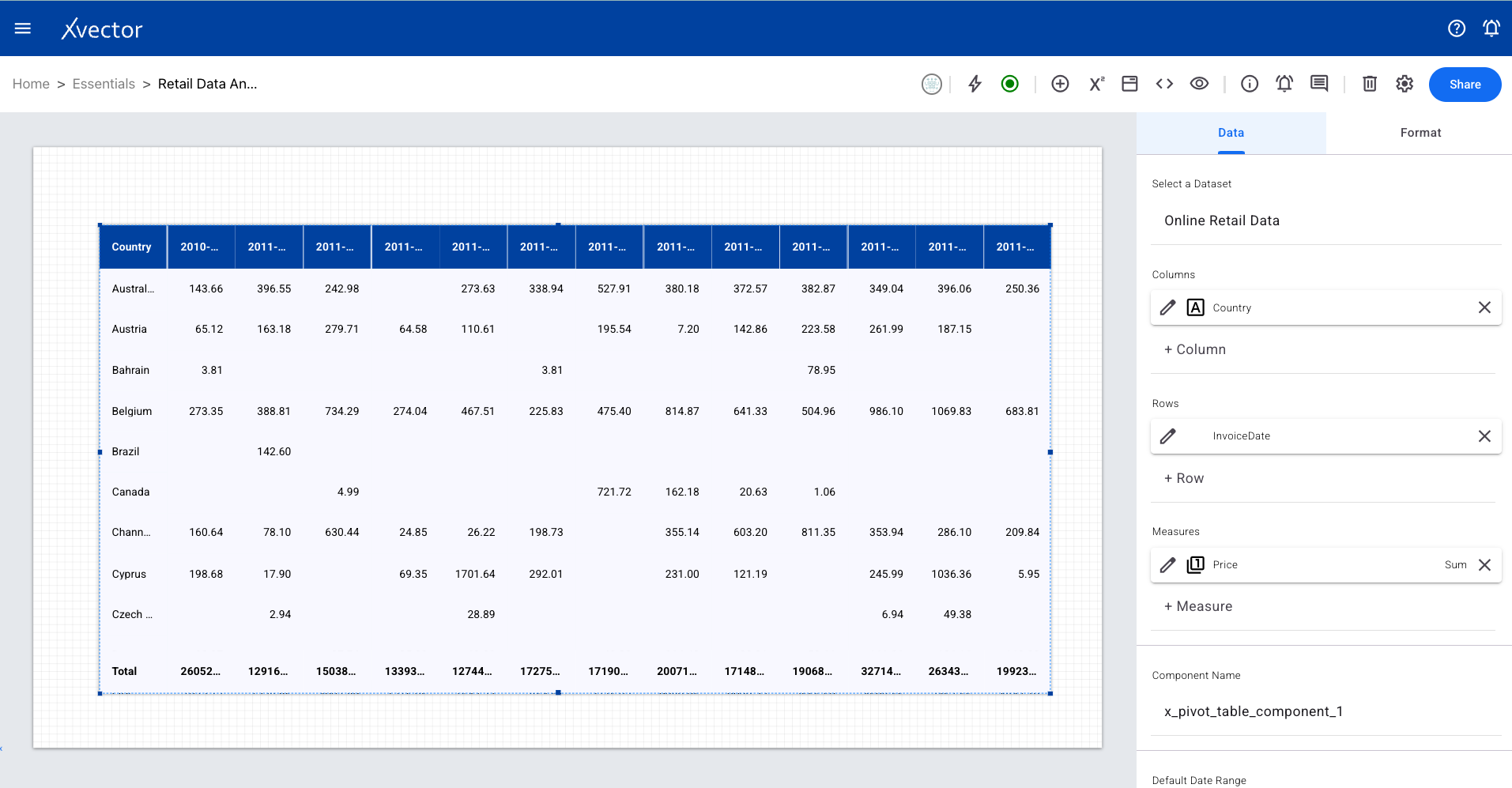
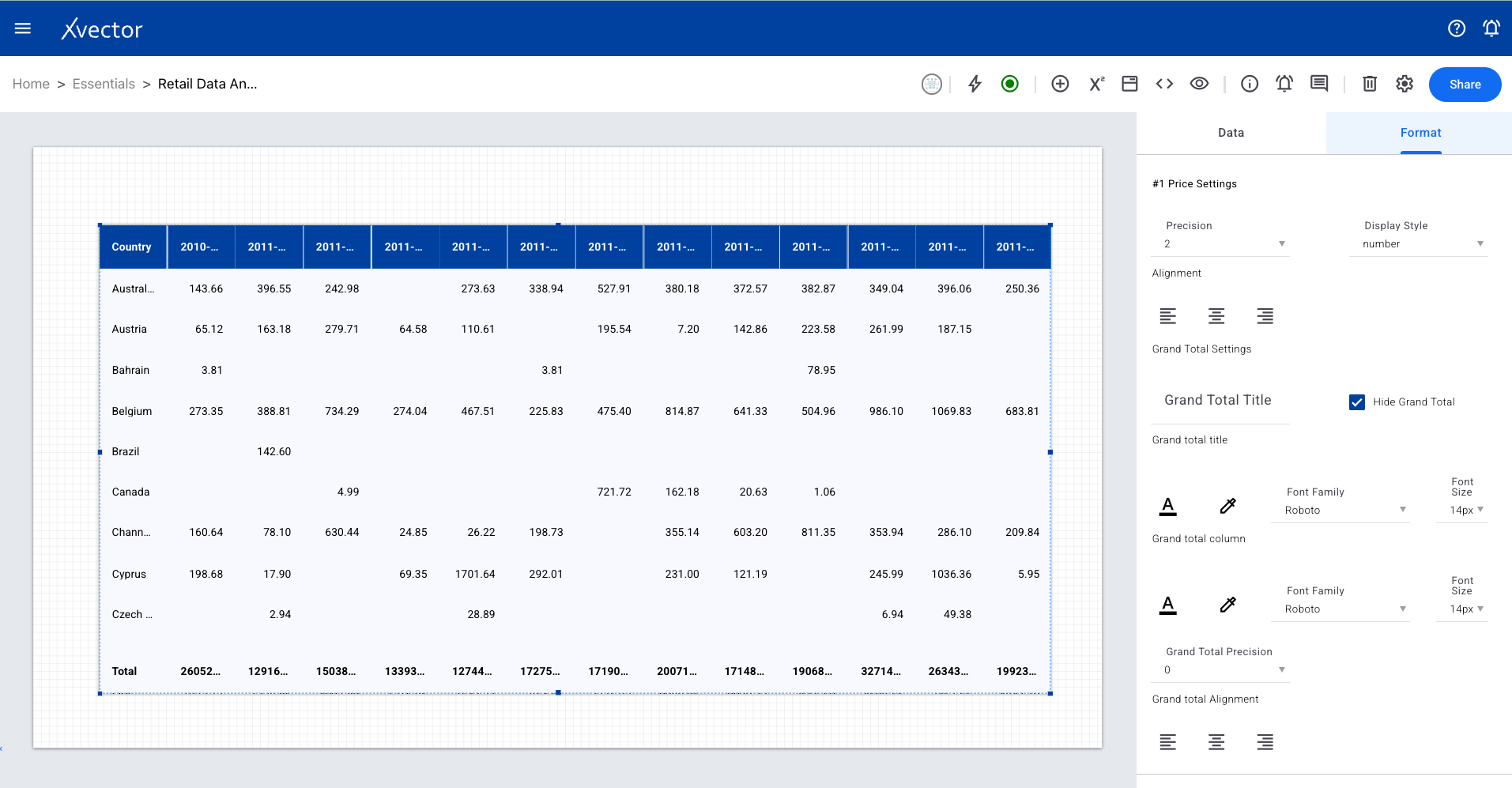
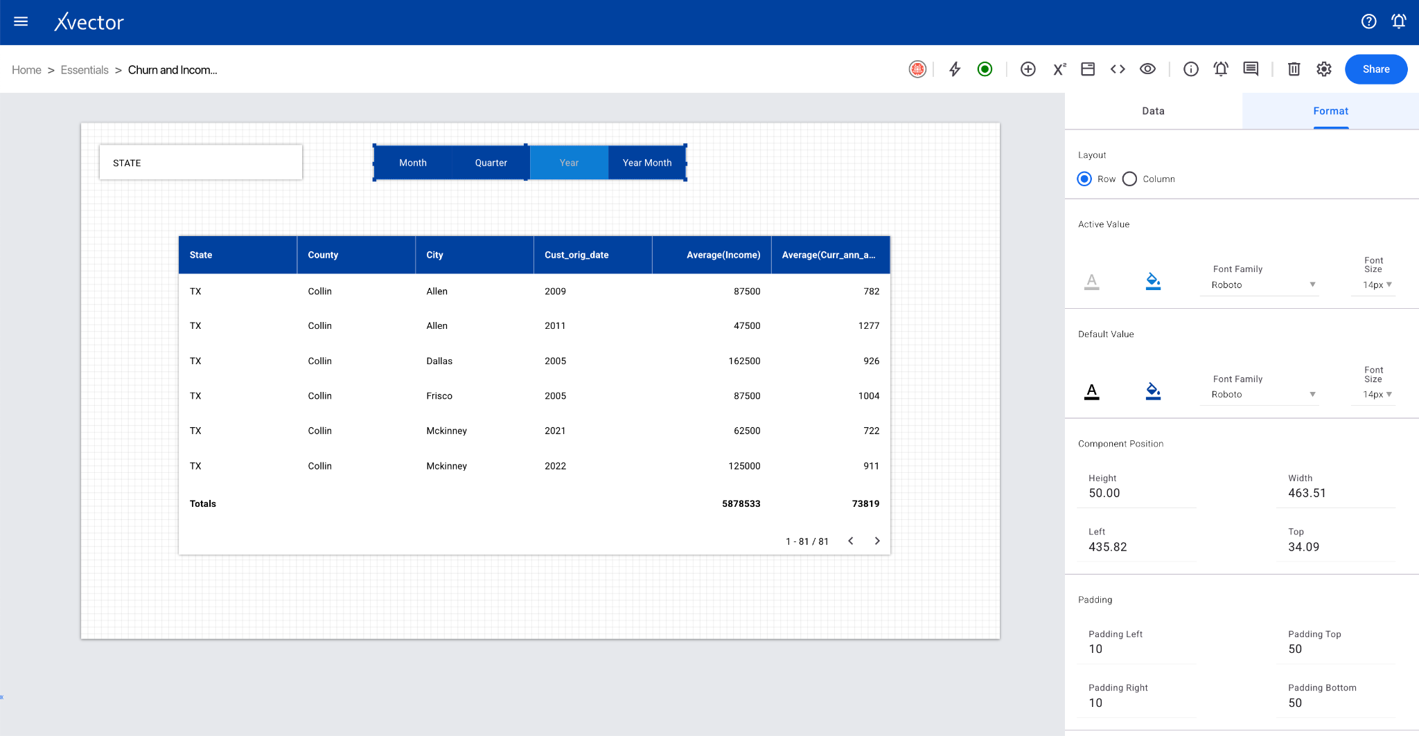
Pivot Table
Section titled “Pivot Table”Summarizes and organizes data for easier understanding. Define which data goes into rows and which goes into columns, with aggregation functions applied.
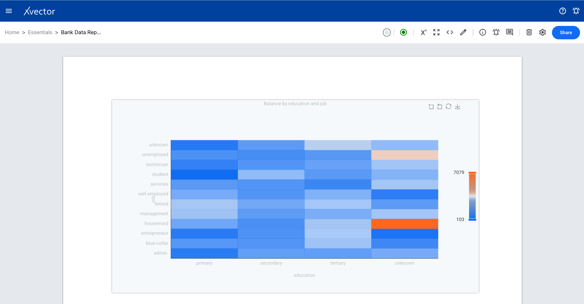
Heatmap
Section titled “Heatmap”A visual representation of data that uses color coding to depict the magnitude of values. Each cell’s color intensity or hue represents the underlying value.
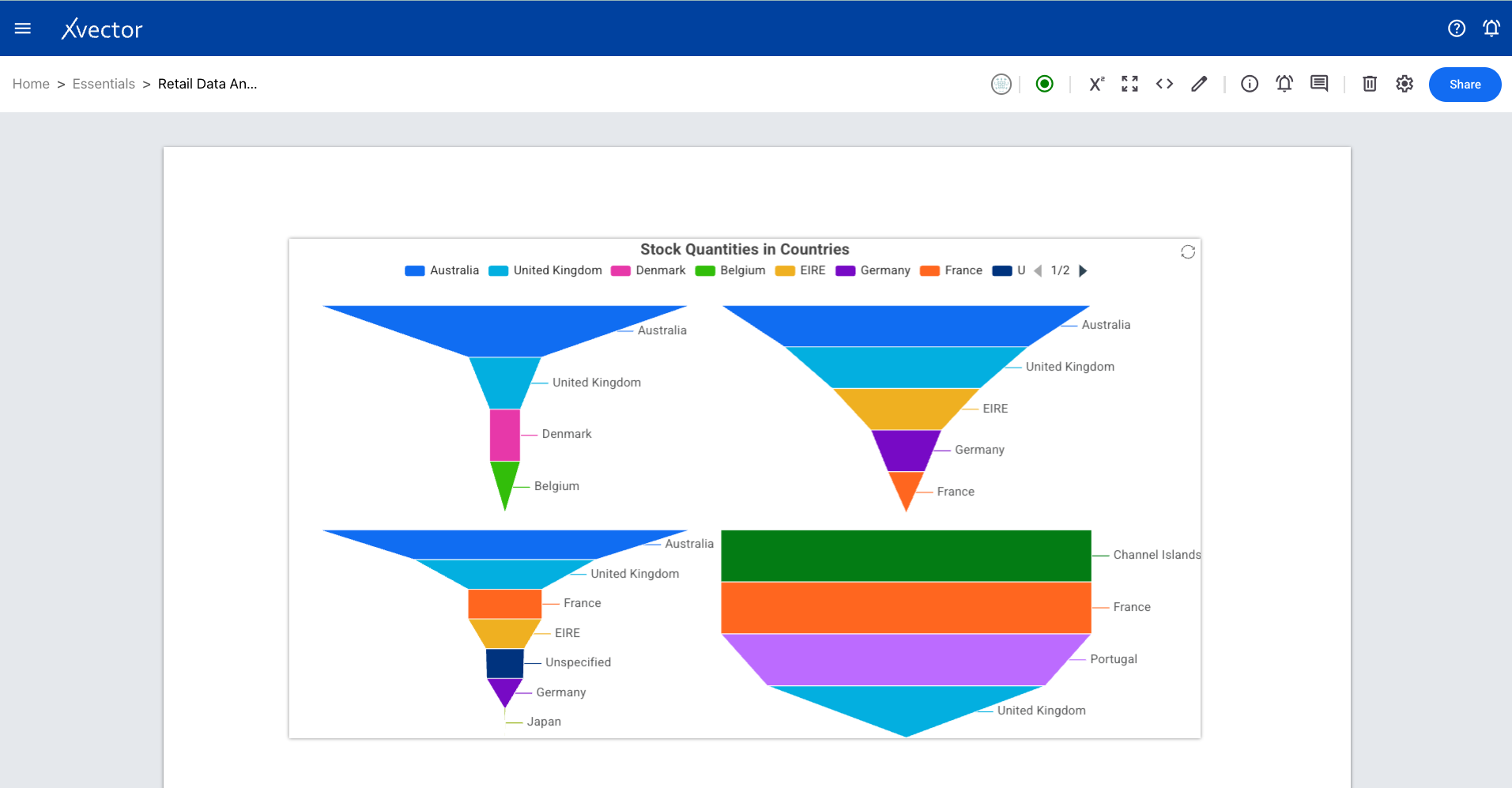
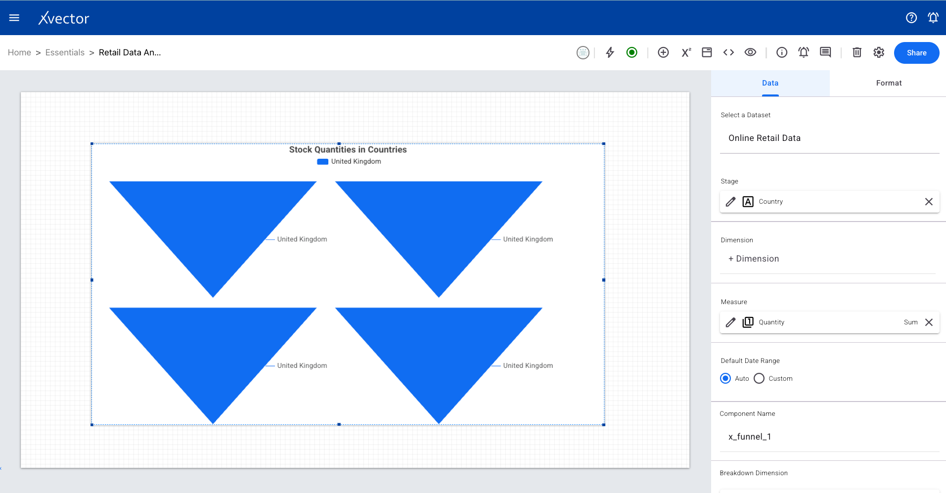
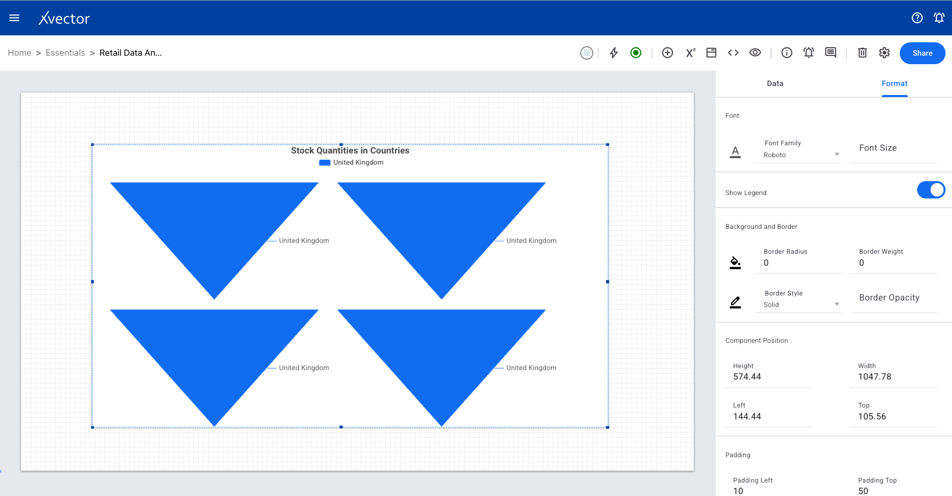
Funnel
Section titled “Funnel”Divided into horizontal sections with the widest at top and narrowest at bottom. Each section represents a stage in a process, showing progression and drop-off.
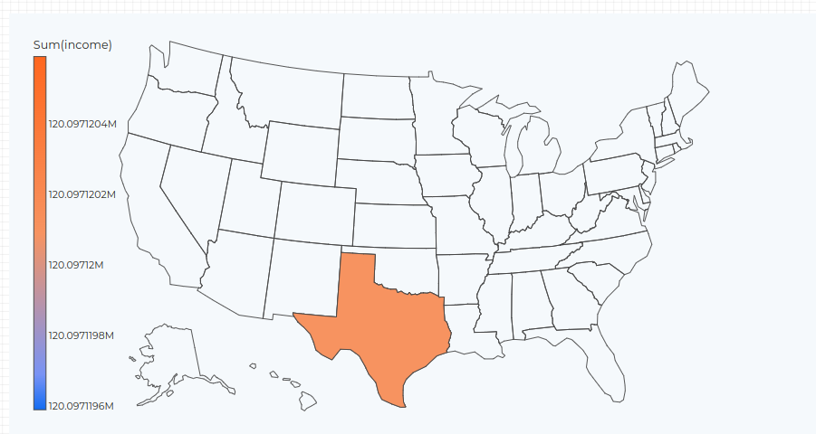
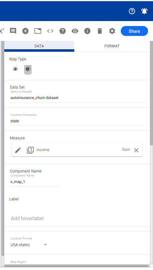
Geomap
Section titled “Geomap”Uses maps to analyze and understand information tied to geographical locations. Visualize data distribution across regions and territories.
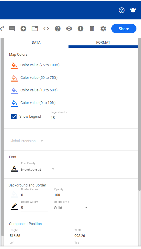
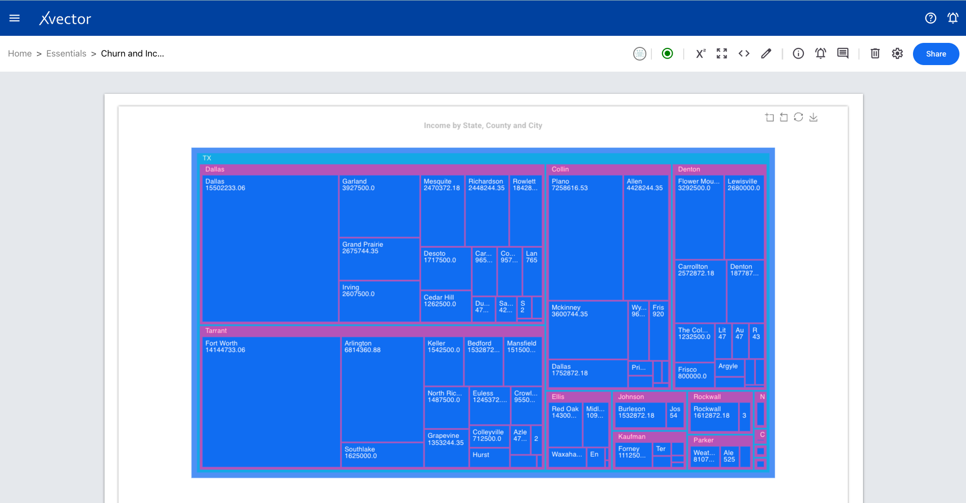
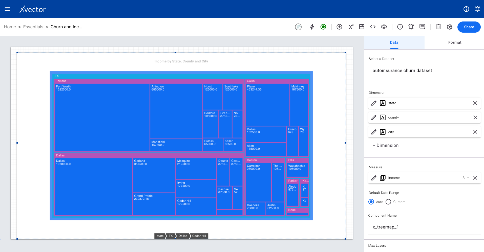
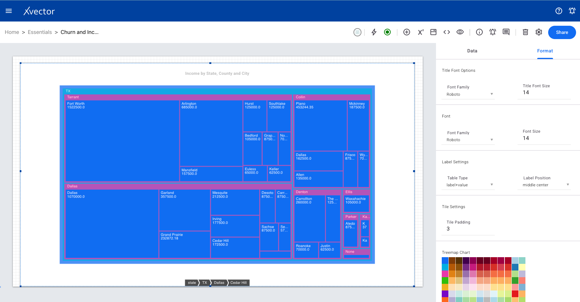
Treemap
Section titled “Treemap”Utilizes nested rectangles to display hierarchical data. Handy for showing part-to-whole relationships and identifying how individual categories contribute to the whole.
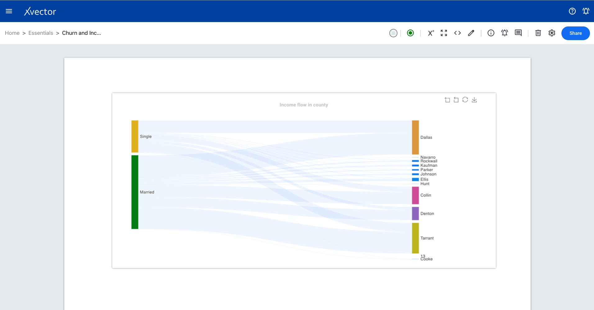
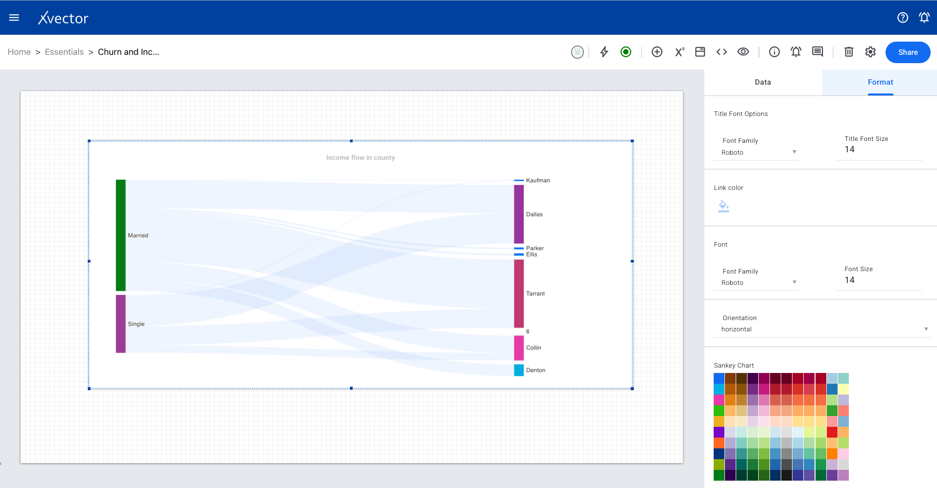
Sankey
Section titled “Sankey”Depicts flows between different stages or categories using arrows, with arrow width corresponding to the flow magnitude.
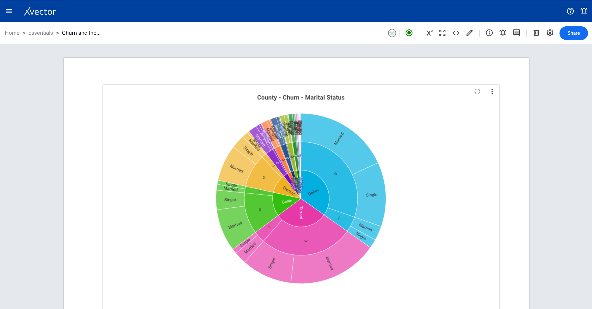
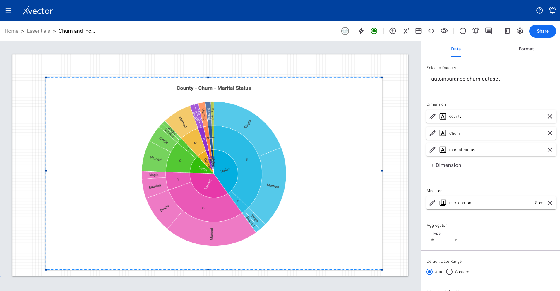
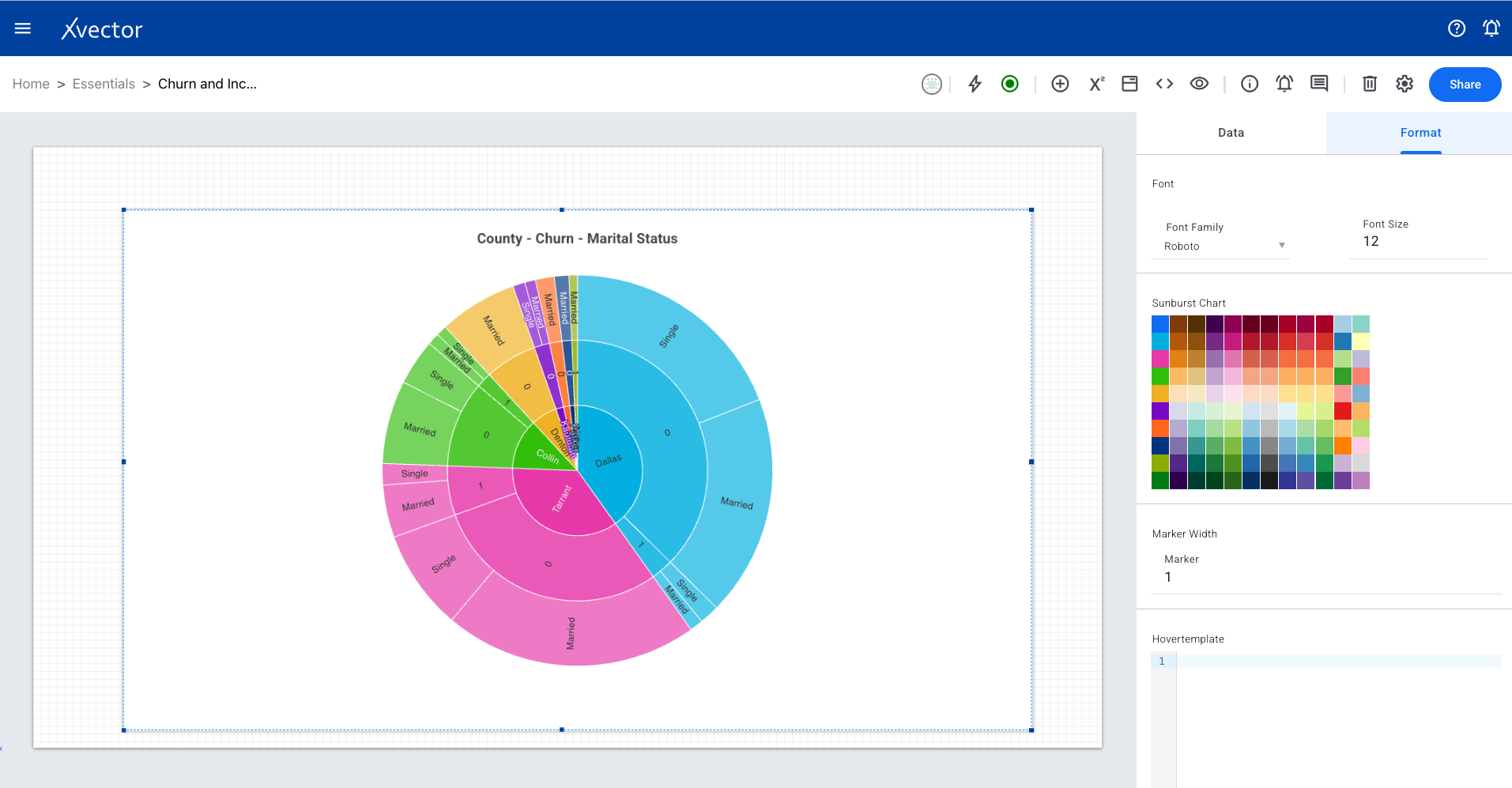
Sunburst
Section titled “Sunburst”Represents hierarchical data in a circular structure. Each ring represents a level in the hierarchy, with the innermost ring being the top level.
Adds an image to the report sheets. Select the image source and configure positioning.
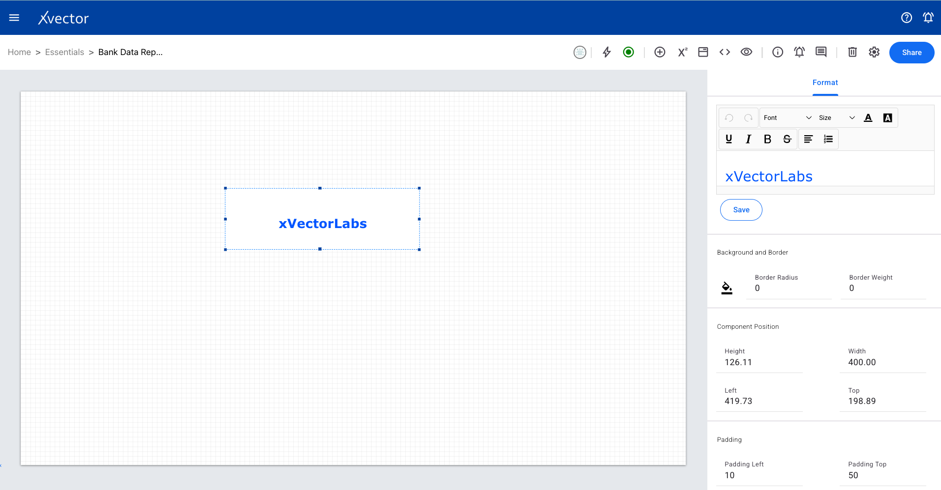
Adds text fields to the report sheets. Configure text content and formatting.
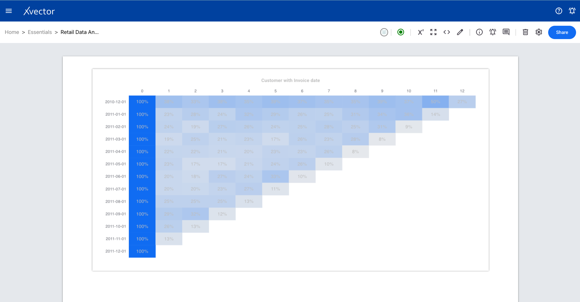
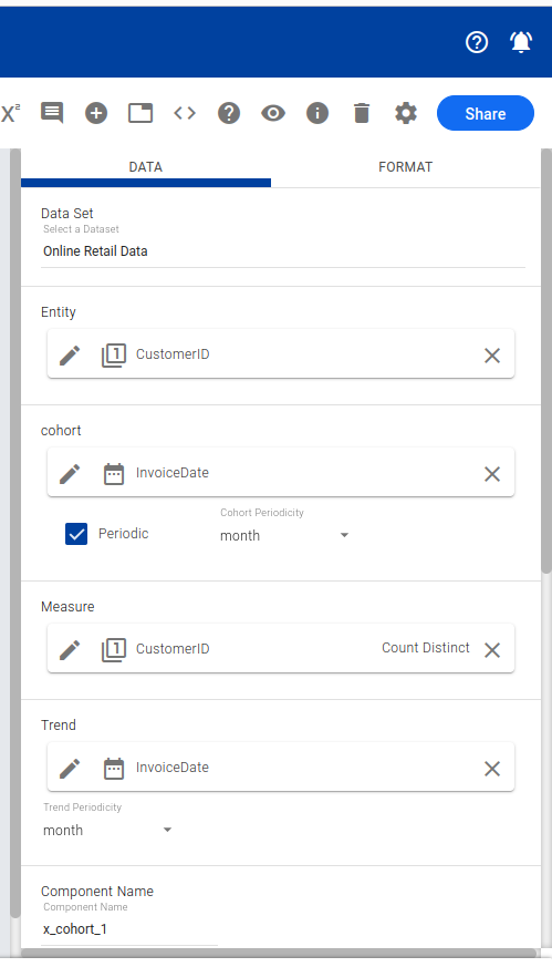
Cohort Analysis
Section titled “Cohort Analysis”A behavioral analytics technique to understand how different groups of users (cohorts) interact with a product or service over time.
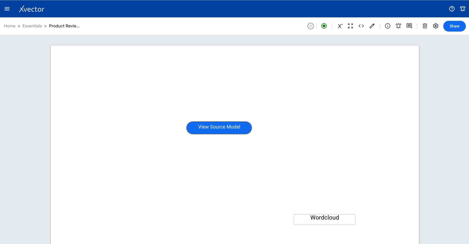
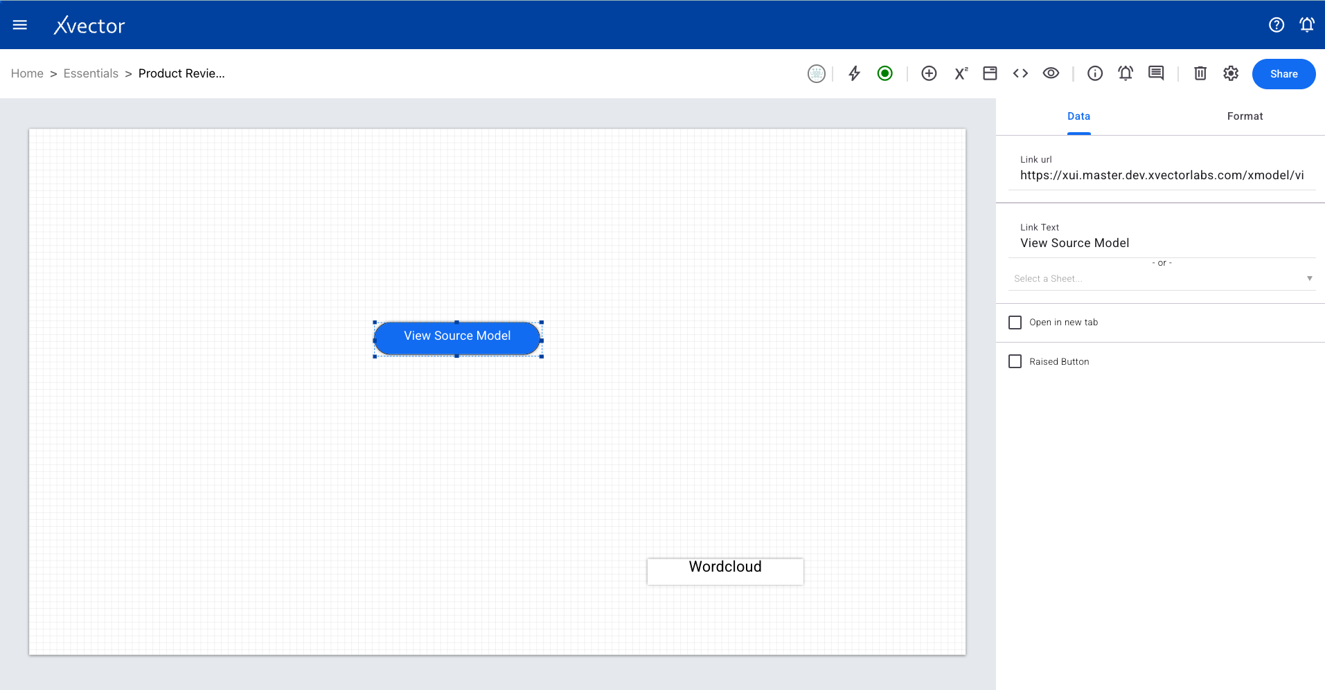
Provides an option to open another sheet or report, enabling navigation between related views while preserving context.
Organizes different report components into tabs for a cleaner layout and easier navigation.
Model Visualizations
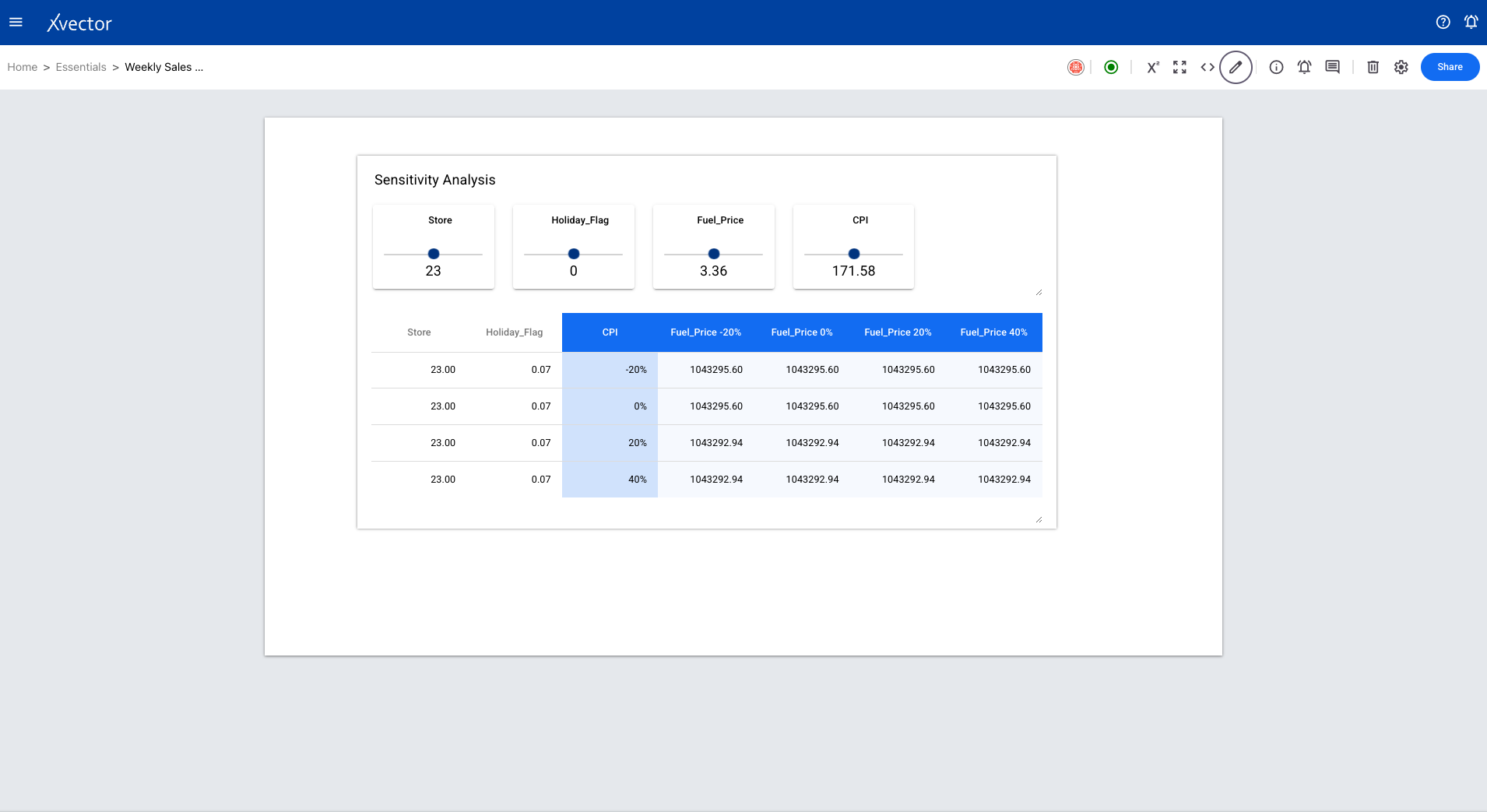
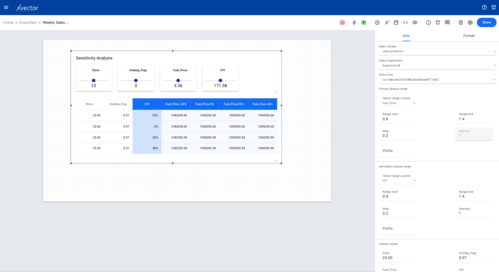
Section titled “Model Visualizations”Sensitivity Analysis
Section titled “Sensitivity Analysis”A trained model takes multiple feature values (column values) and produces an output. Sensitivity analysis shows how changes in individual features affect the model’s prediction, helping users understand feature importance.

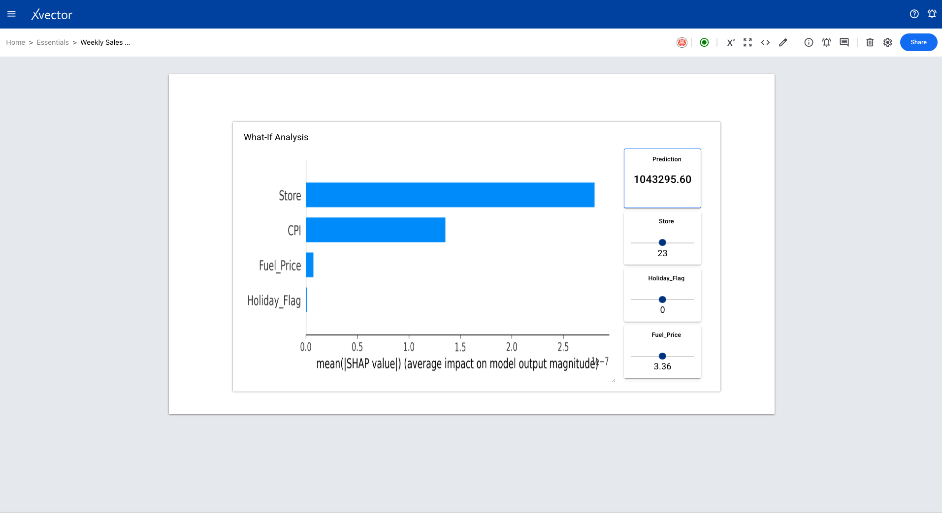
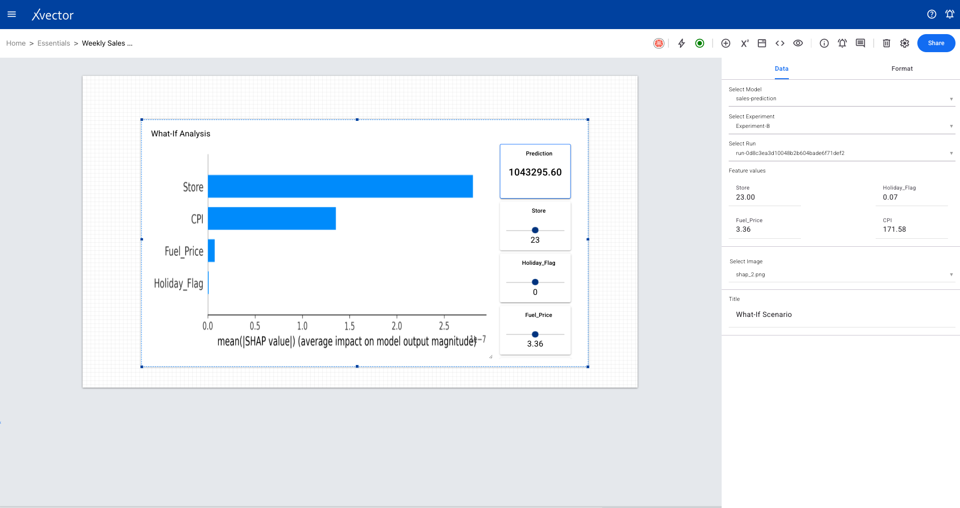
What If Scenario
Section titled “What If Scenario”A trained model takes multiple feature values and produces an output. Users can provide specific values to each feature and see how the model’s prediction changes — enabling scenario planning and decision support.
Timeseries Forecast
Section titled “Timeseries Forecast”Visualizes time series model forecasts directly within reports.
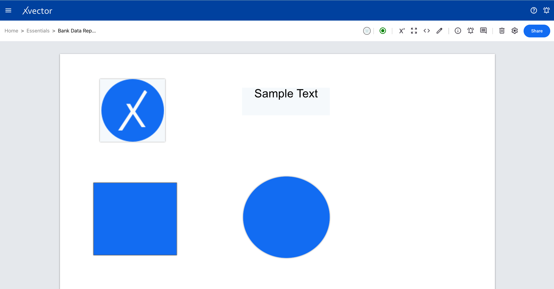
Shapes
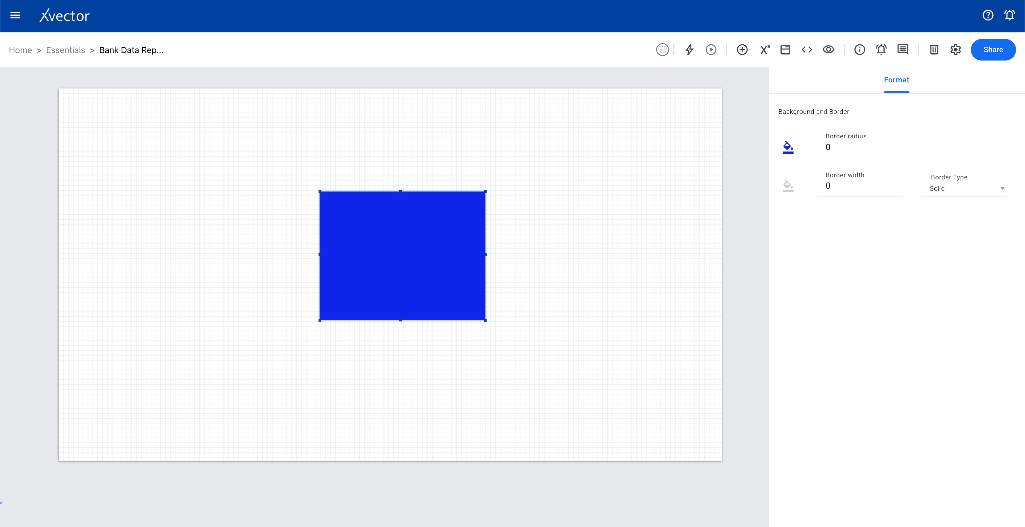
Section titled “Shapes”Rectangle
Section titled “Rectangle”Creates a rectangle shape on the sheet for layout and design purposes.
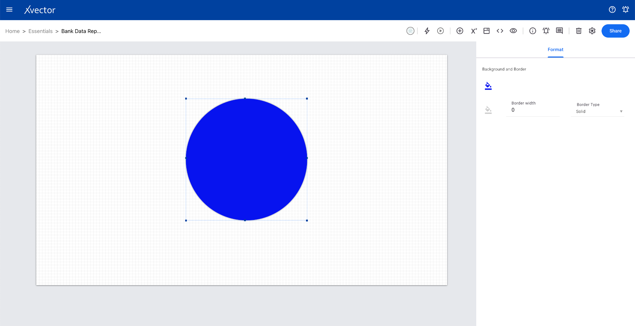
Circle
Section titled “Circle”Creates a circle shape on the sheet for layout and design purposes.
Controls
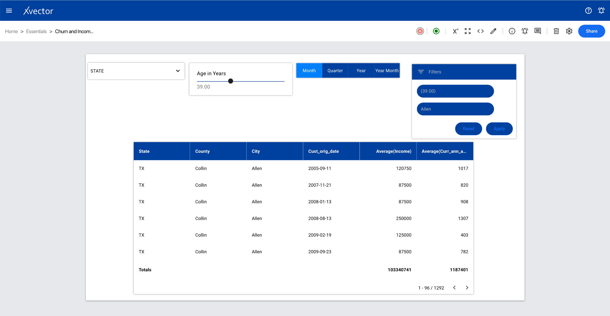
Section titled “Controls”Filters
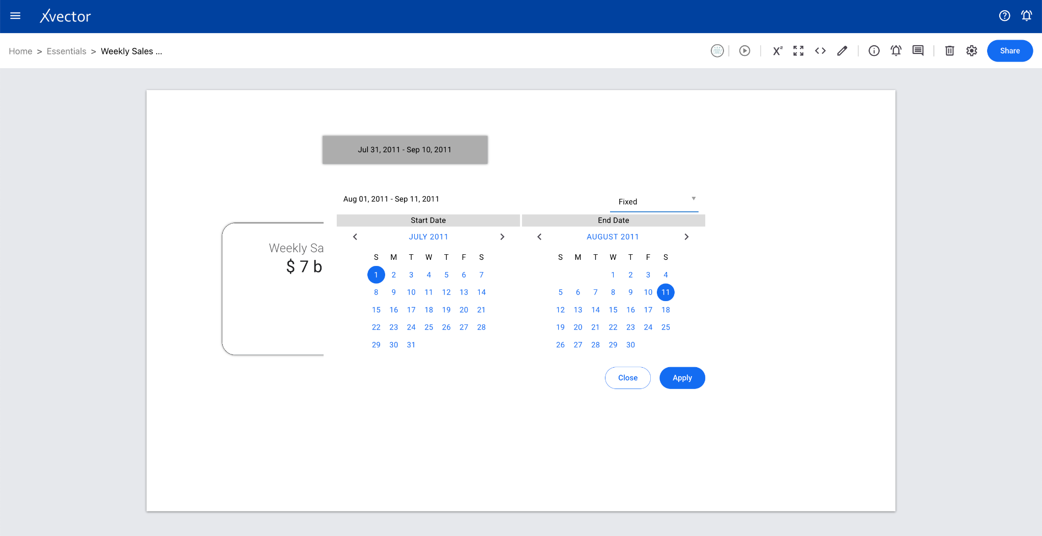
Section titled “Filters”Date Range
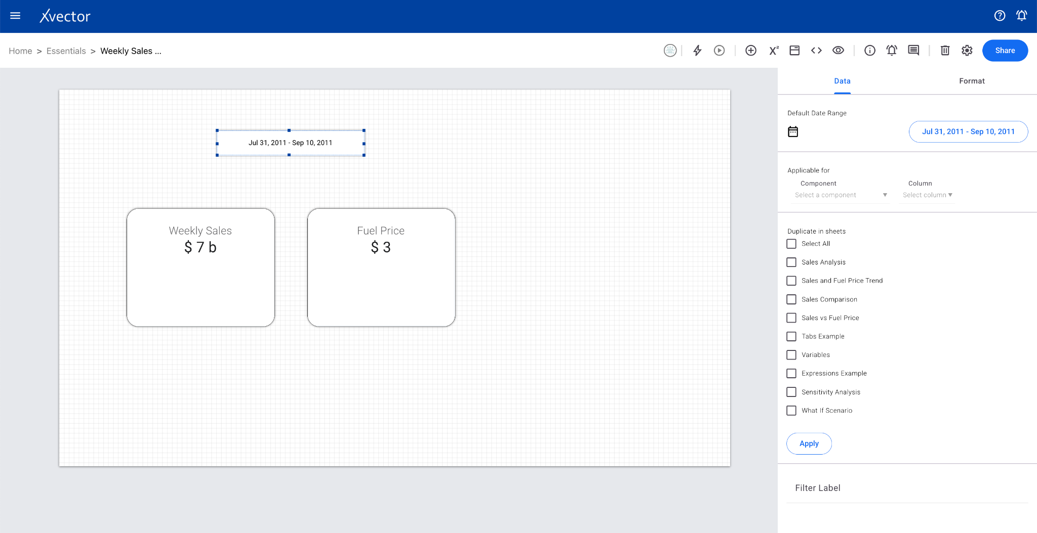
Section titled “Date Range”Applies date ranges by specific dates, months, or years to selected report components. Provides flexible time filtering for data analysis.

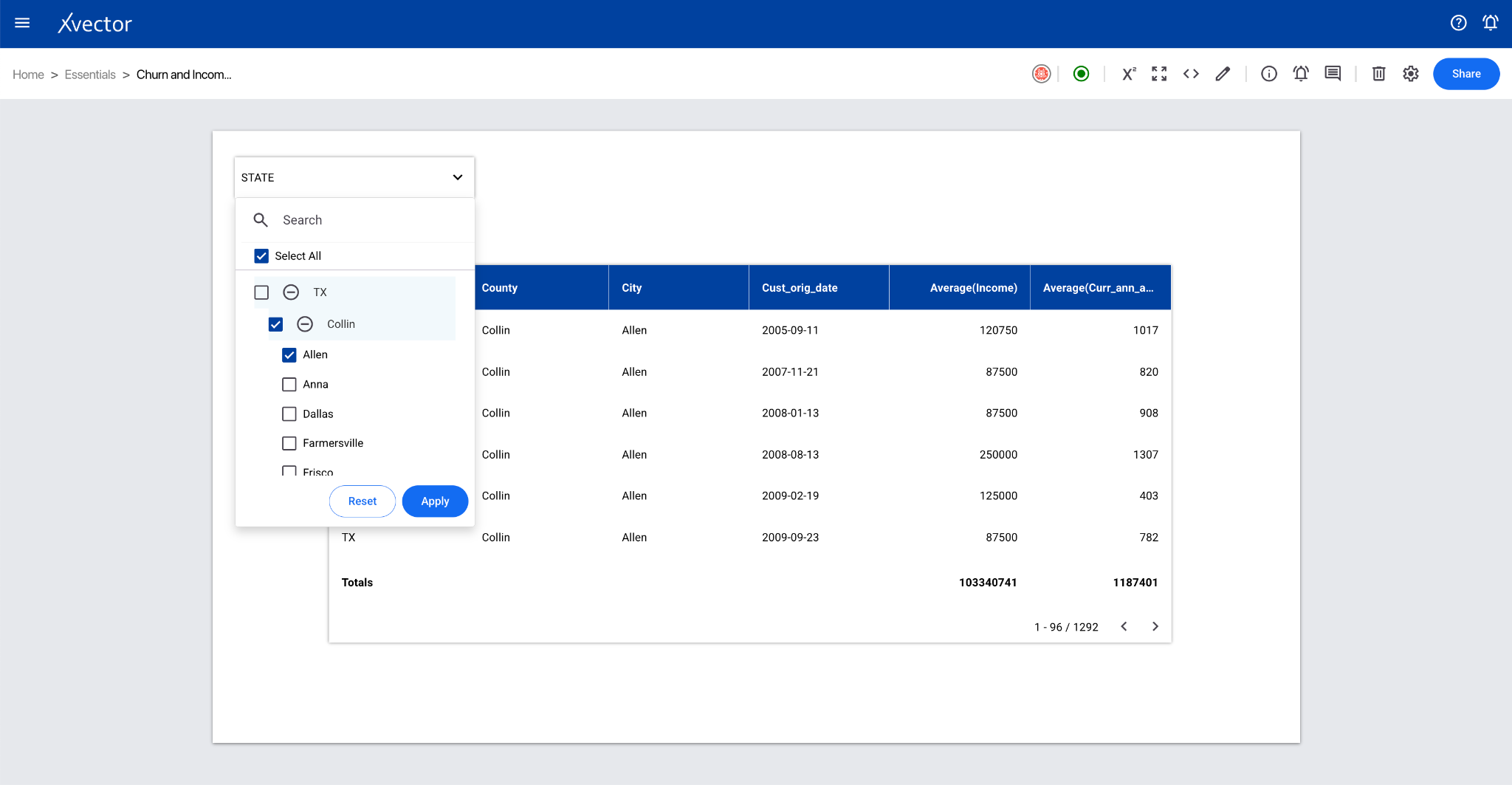
Entity Filter
Section titled “Entity Filter”Filters data by various entities such as products, channels, and geography. Applying entity filters on report components allows drilling into specific segments.
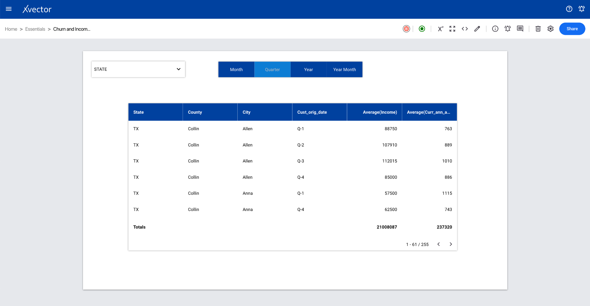
Date Aggregator
Section titled “Date Aggregator”Applies date aggregate functions such as day/week/month/quarter for time-based datasets, providing greater granularity to time-series visualizations.

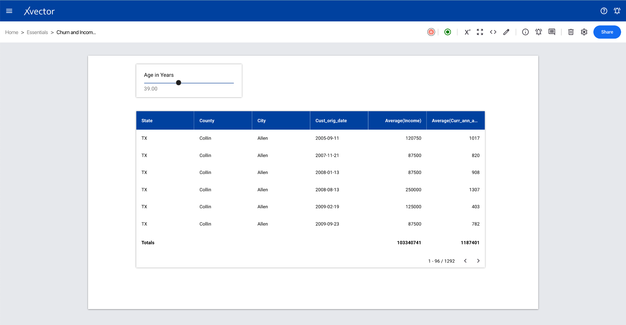
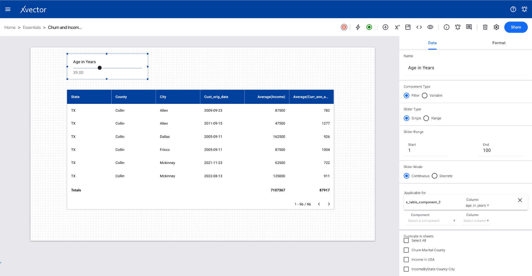
Slider
Section titled “Slider”Filters a numeric column with a given range. The component on which the slider is applied will fetch records within the specified range.
Filter Collection
Section titled “Filter Collection”View and manage all applied filter values on the current report sheet.
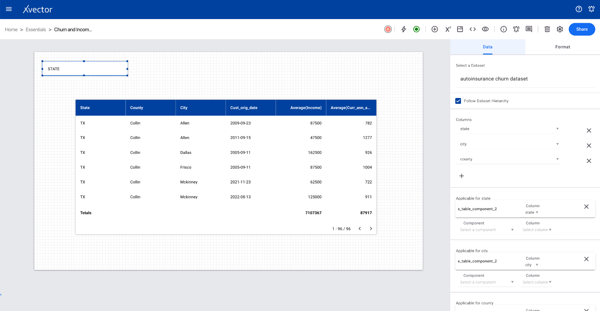
Dynamic Column
Section titled “Dynamic Column”A feature to create components that can dynamically change based on user selection. For example, if a report has three different date types (Date of Service, Date of Entry, Date of Billing), users can switch between them from a strip.
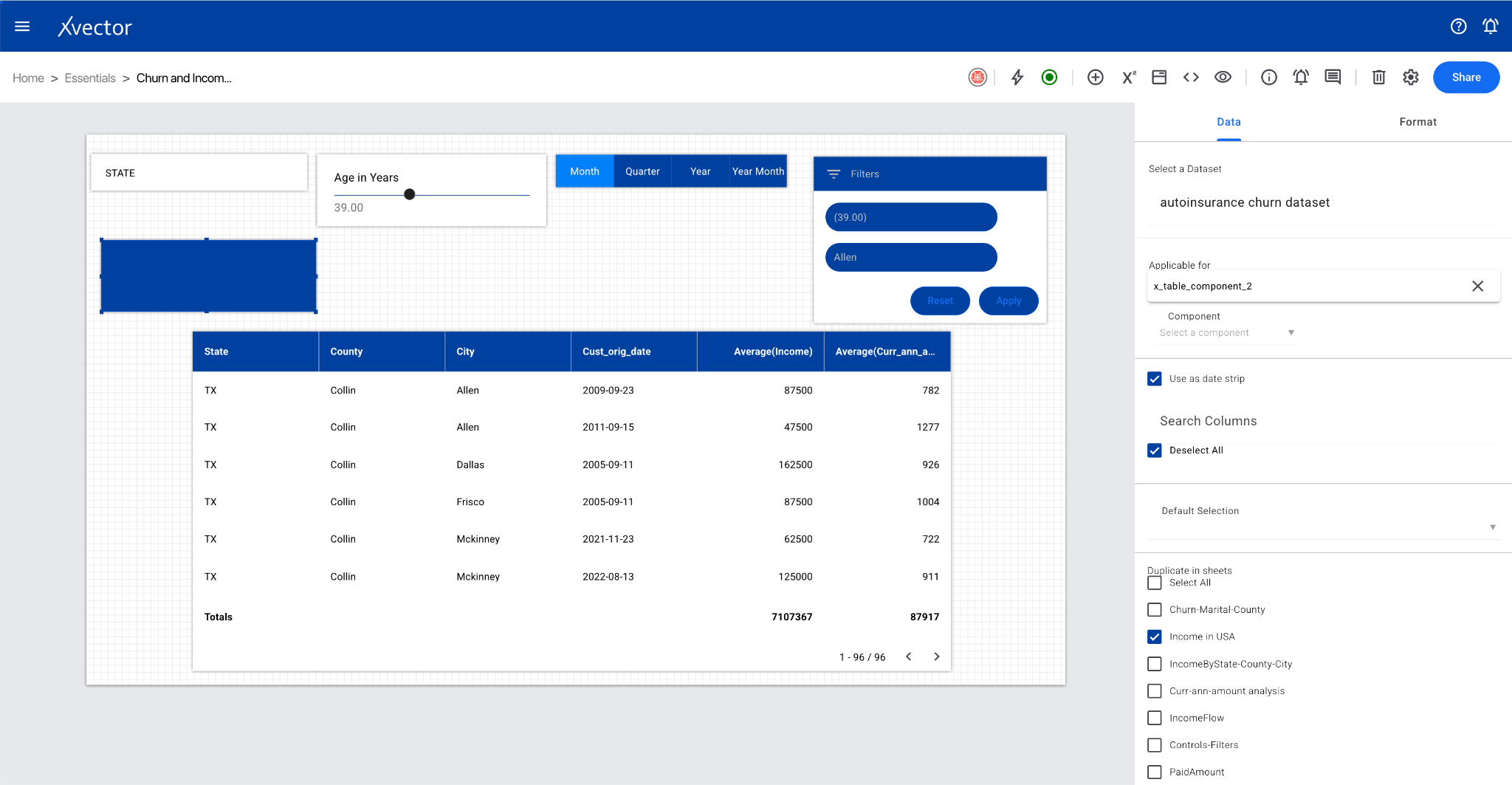
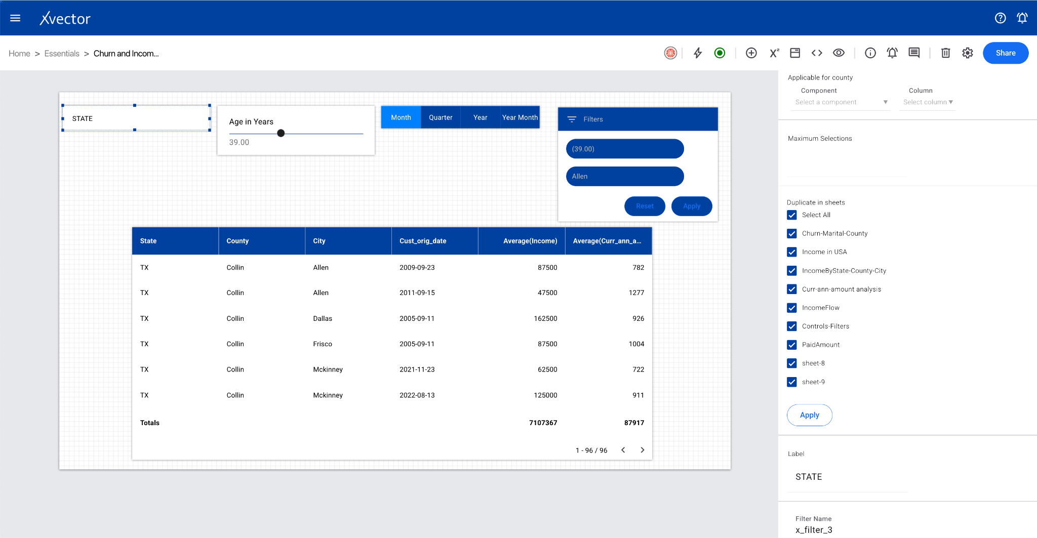
Sticky Filters
Section titled “Sticky Filters”Carries over filters from one sheet to another. Select different sheets under the Data tab in the “Duplicate in sheets” section to maintain filtering context across views.
Dimension
Section titled “Dimension”Allows you to get chart values (line/bars) for each category value present in the selected dimension column. A way to dynamically switch between different dimensional views.
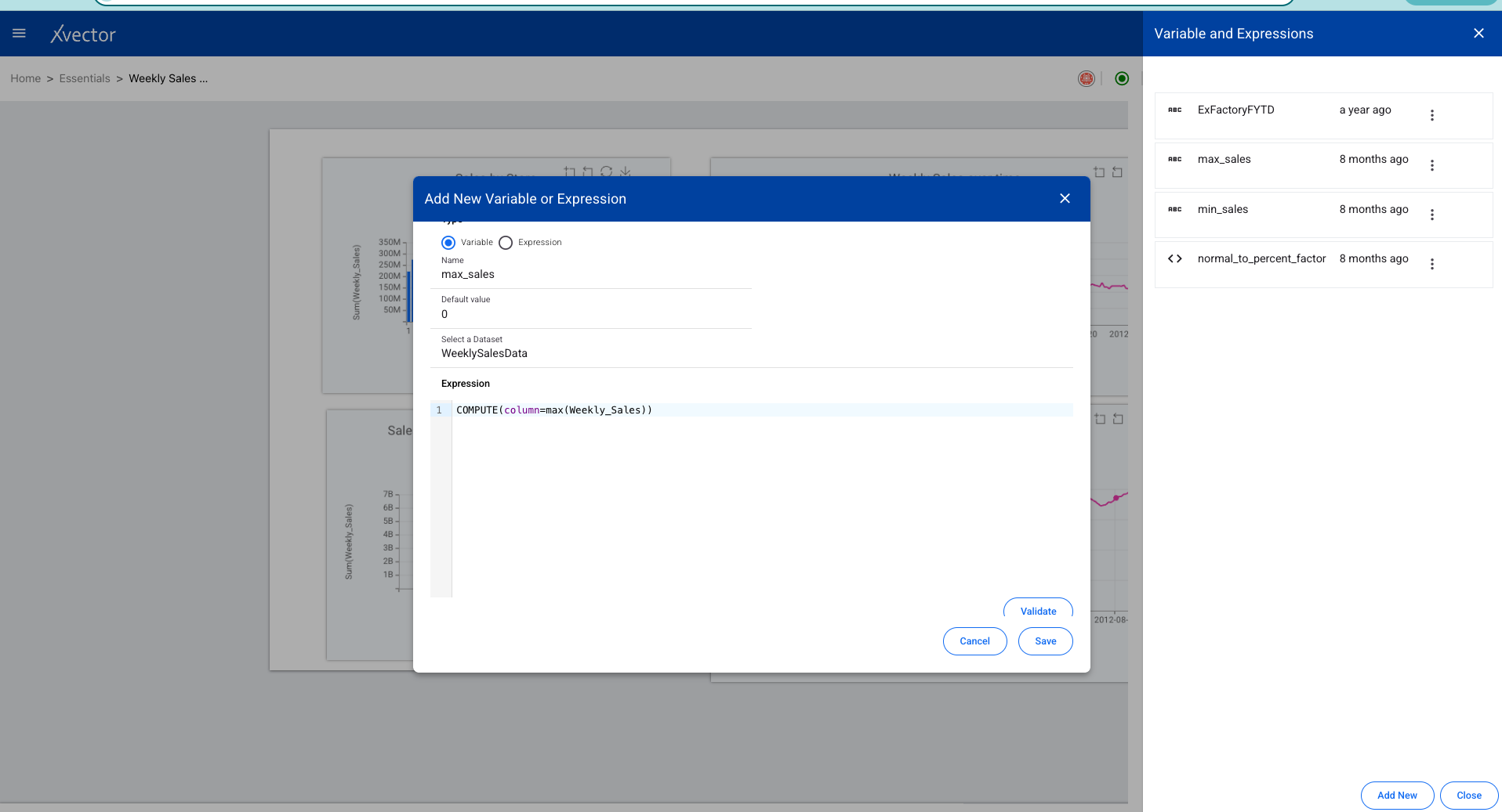
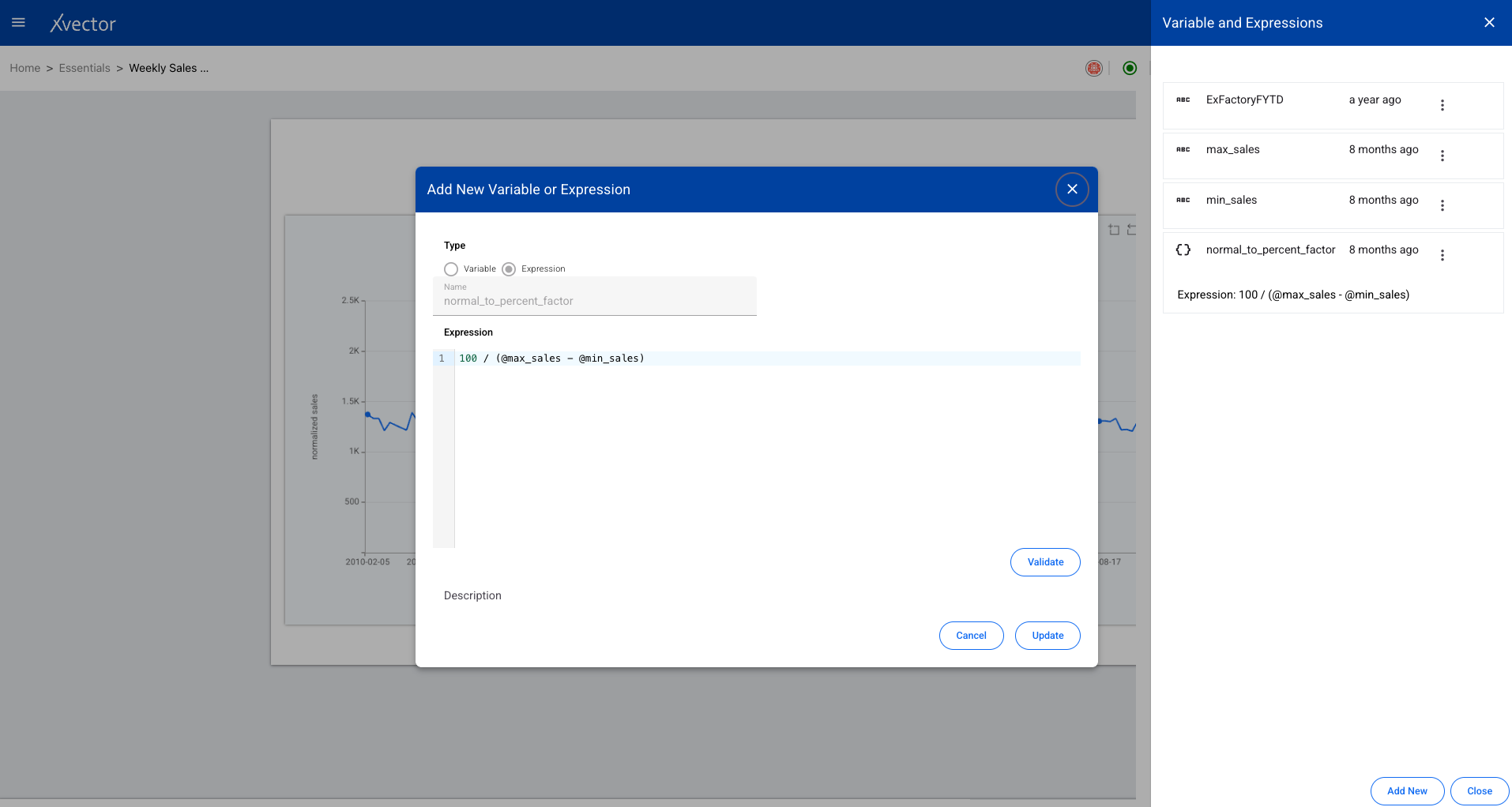
Variables
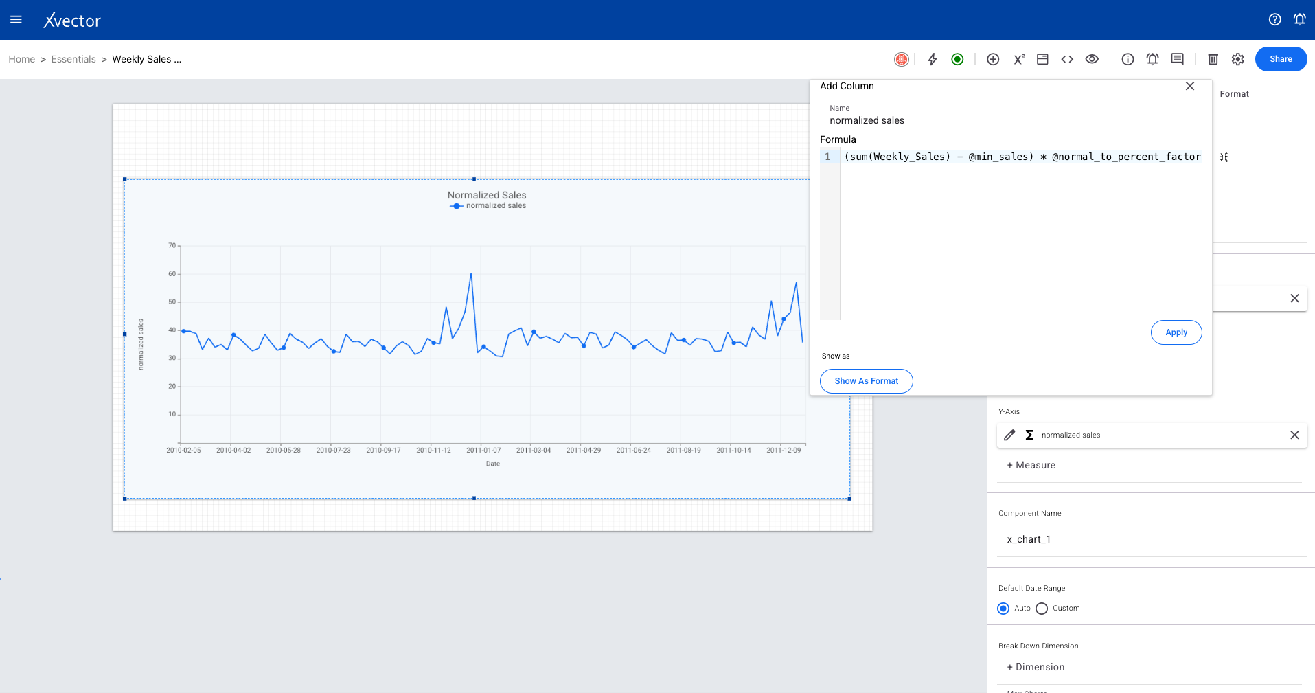
Section titled “Variables”A variable enables values populated from a dataset or inputs. Custom expressions can use variables in advanced expressions, providing dynamic data binding throughout the report.

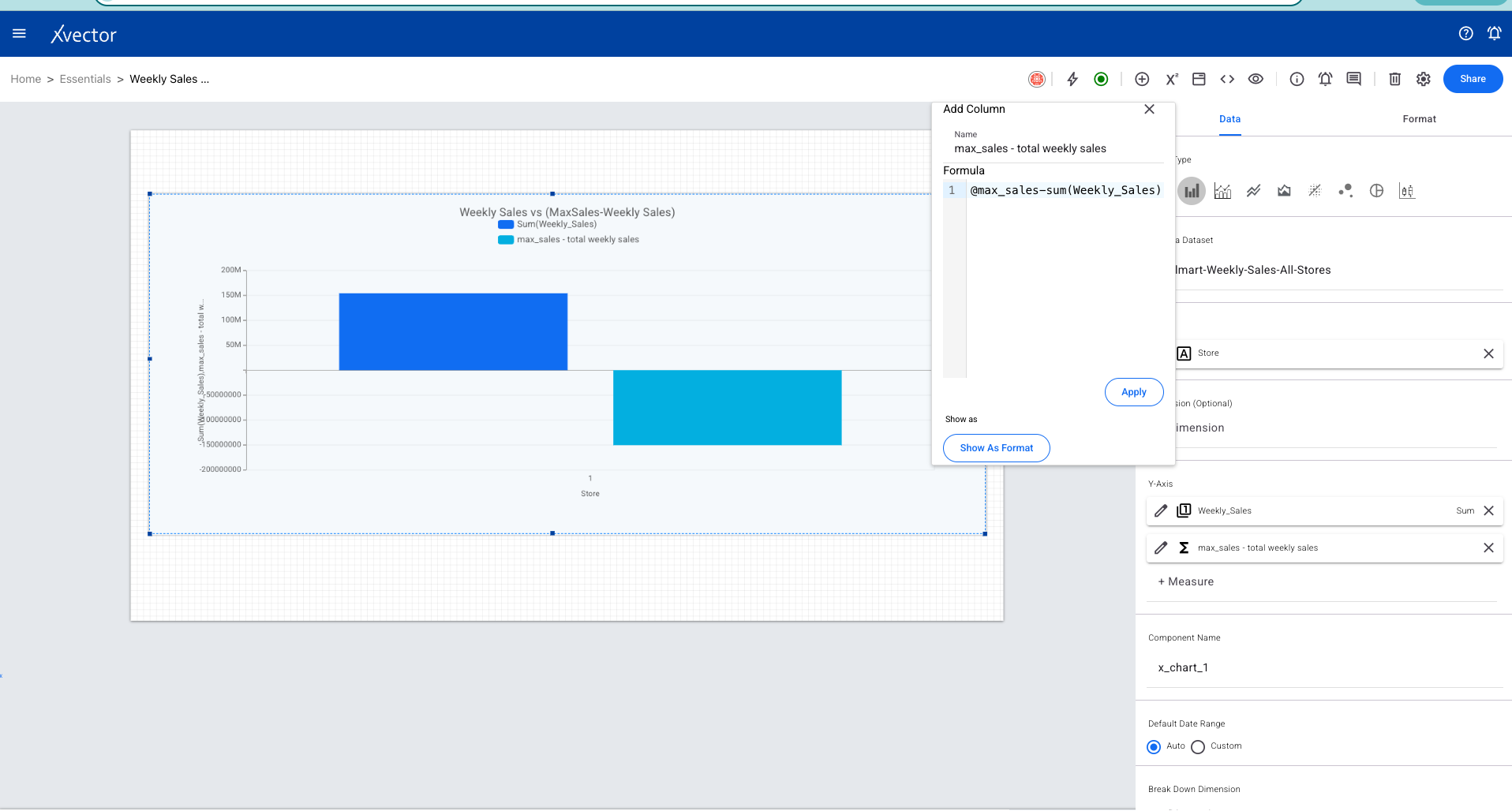
Expression
Section titled “Expression”Expressions allow complex formulas to be authored using the richness of various functions, enabling more dynamism and richness in reports.
Context Strings
Section titled “Context Strings”Context Strings provide the mechanism to use values from other sibling components. This applies primarily to the Scorecard component. Examples include data from scorecard (Primary/Secondary), filter selected value, or input value (single .value or range .start and .end).
Breakdown
Section titled “Breakdown”Breakdown charts visualize how a larger dataset or distribution can be segmented into smaller, more manageable charts. Used to compare sub-groups within the data.
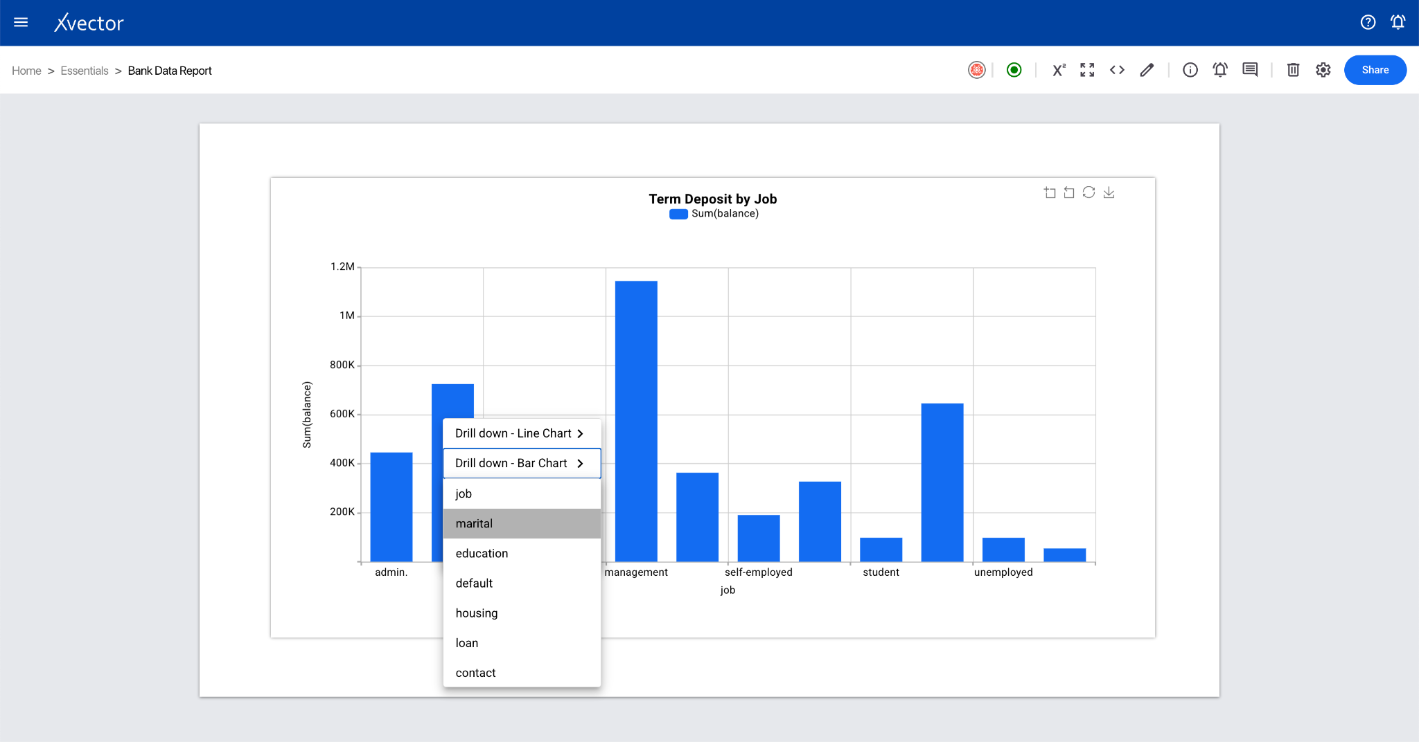
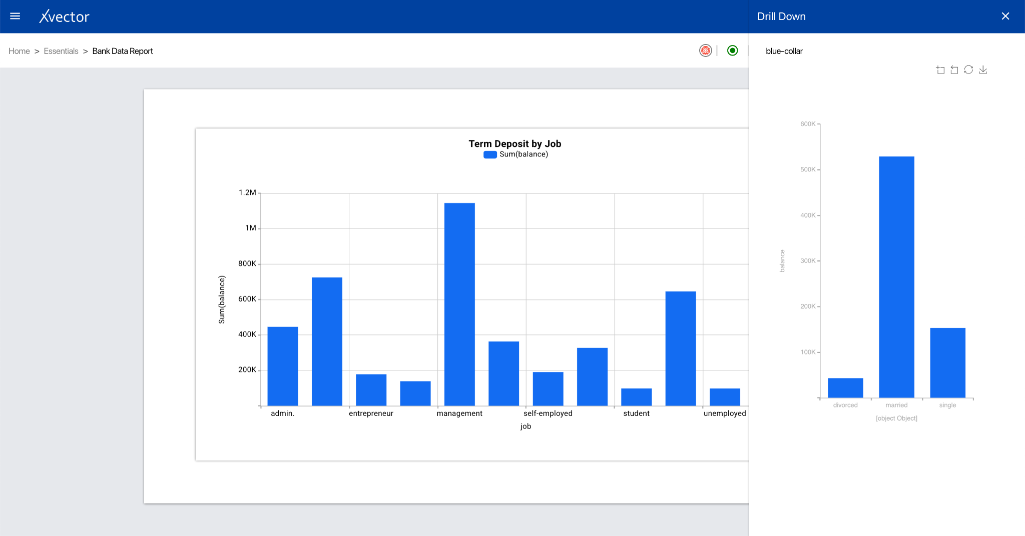
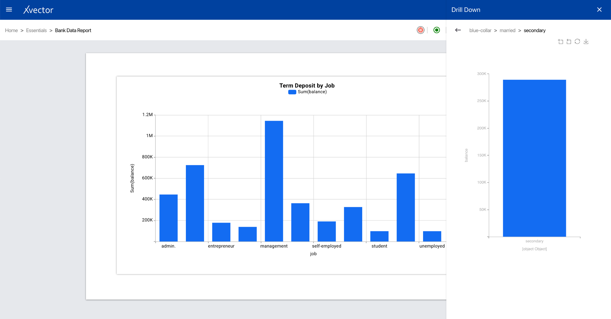
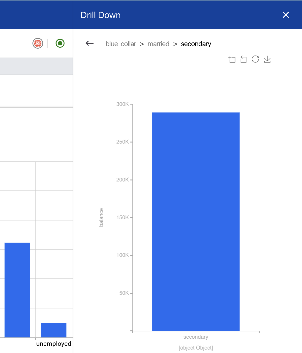
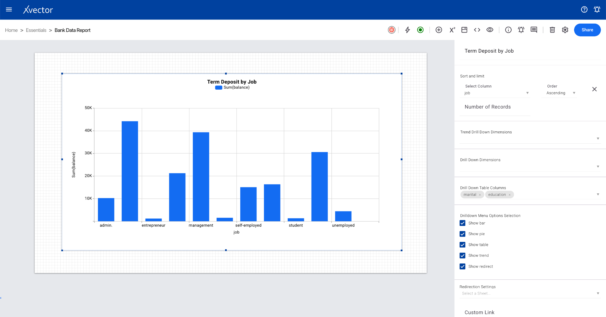
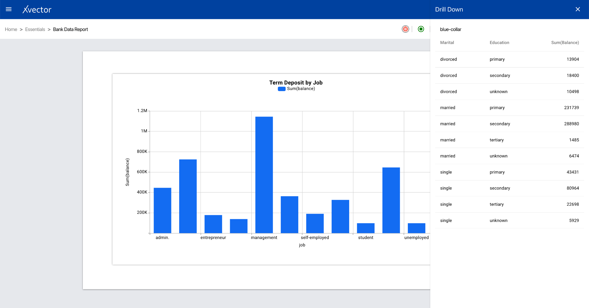
Drill Down
Section titled “Drill Down”The drill-down feature allows exploration of data in greater detail directly from the report component. It takes high-level aggregated data and lets users progressively reveal underlying details.
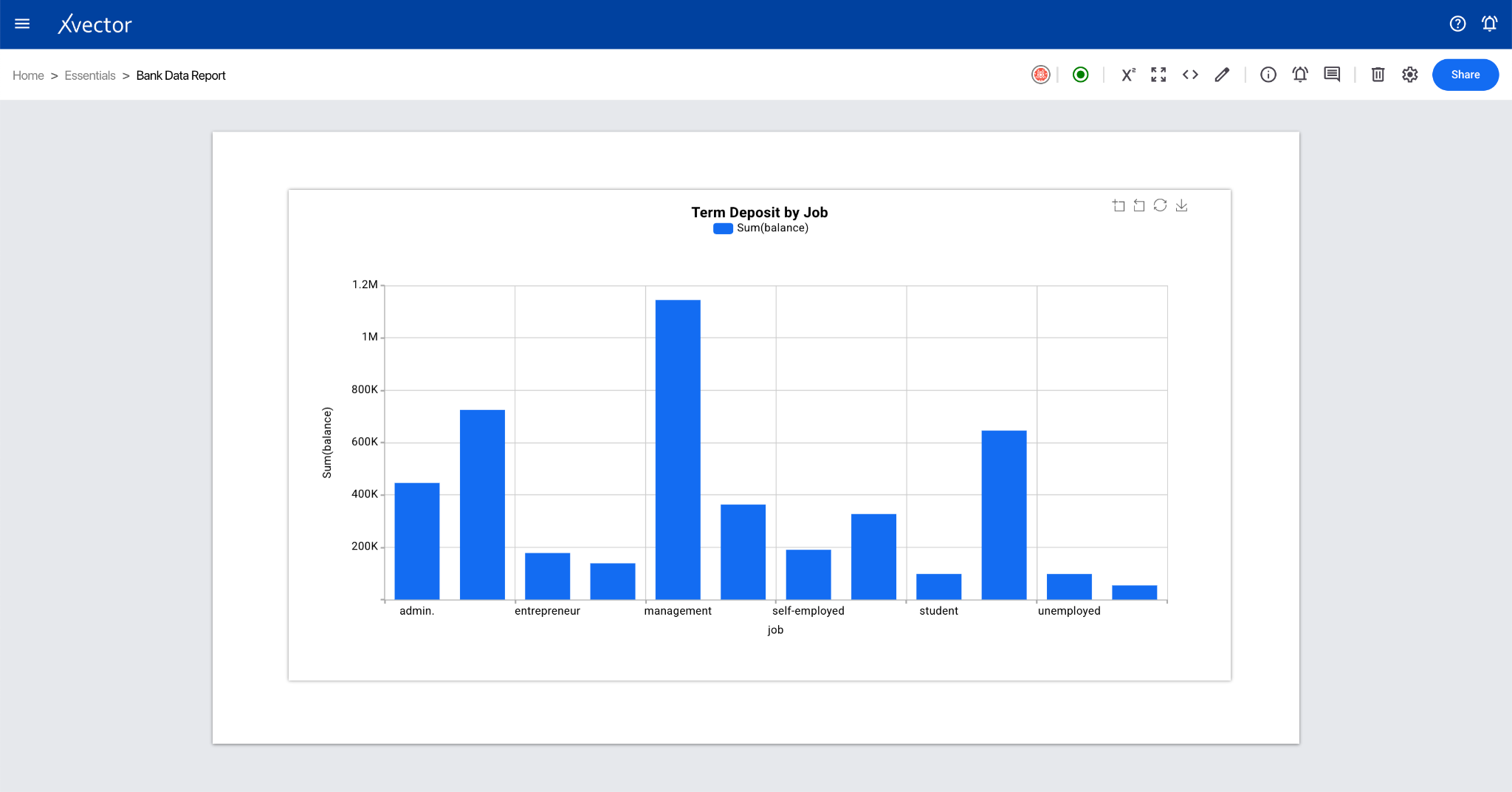
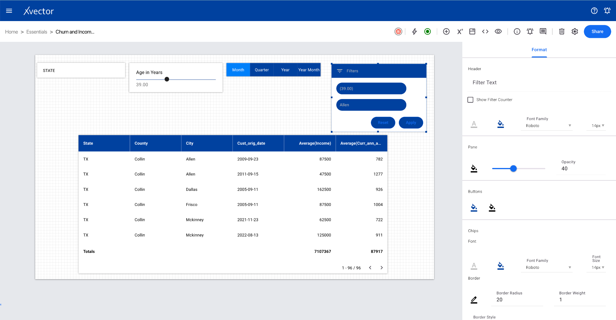
Component Options
Section titled “Component Options”View all options for a component by clicking the menu options (⋮) at the top right corner of each component.
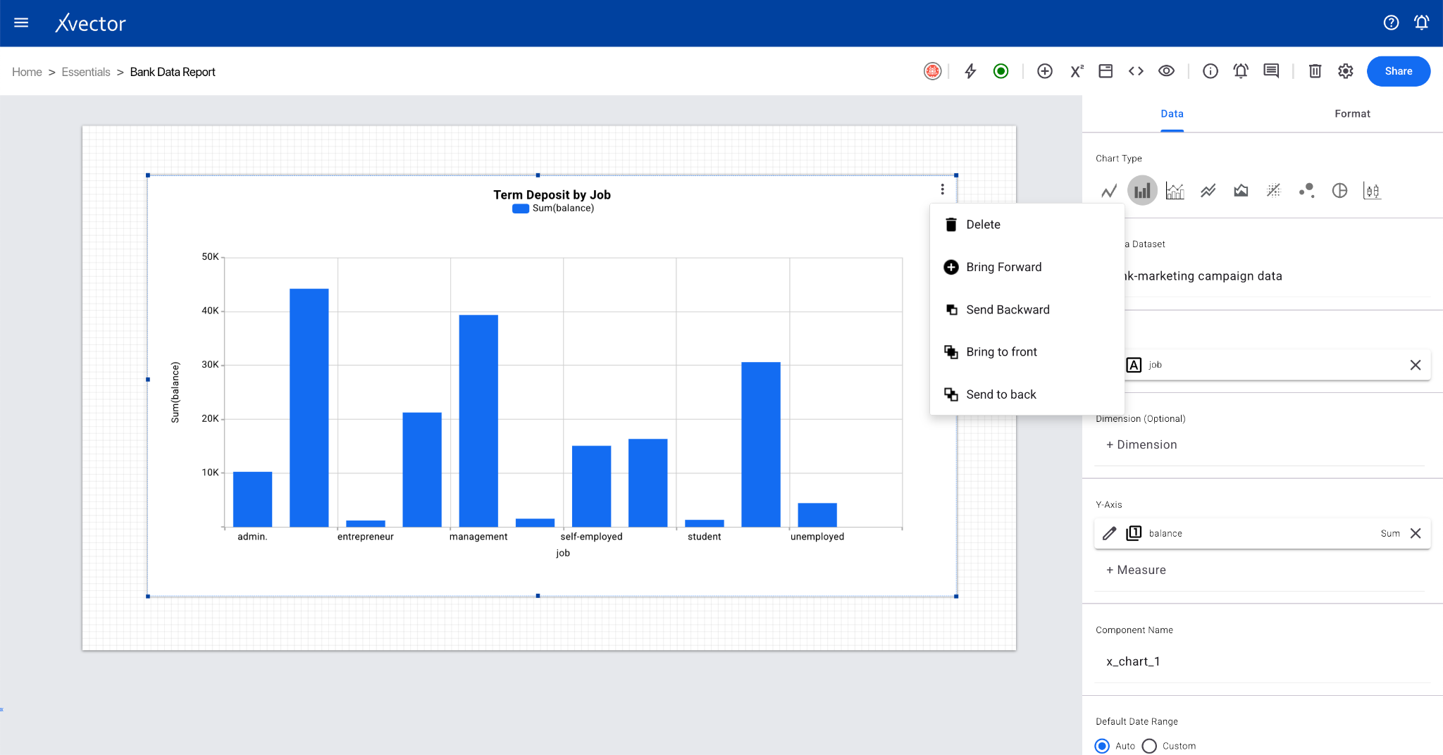
- Delete — Deletes the component
- Bring Forward / Send Backward — Control layering order
- Bring to Front / Send to Back — Move to top/bottom layer
- Copy — Copies the component (can be pasted on other sheets)
- Expand — Expands the component
- View Data — View the dataset used in the report component
Report Options
Section titled “Report Options”
- Presence — Shows which user is on the workspace
- Driver Start/Stop — Start or stop the driver (play button icon) to interact with live data
- Report Variables — Define report variables and expressions
- Full-Screen Mode — View the report in full-screen mode
- Embed this Report — Embed the report component (can be done at sheet level for sharing and collaboration)
- Edit/View — Toggle between edit mode (update configuration) and view mode (read-only)
- Action Logs — View logs of actions taken on the report
- Help — Opens help document
- Comments — View comments
- Delete — Delete the current sheet
- Driver Settings — Open settings for the report driver (enable, disable, or configure a dedicated driver)
- Share — Share the report with other users or groups